

Project details
Duration: 8 weeks
My role: Sole product designer responsible for the UX/UI process, from initial research and persona development through final prototyping
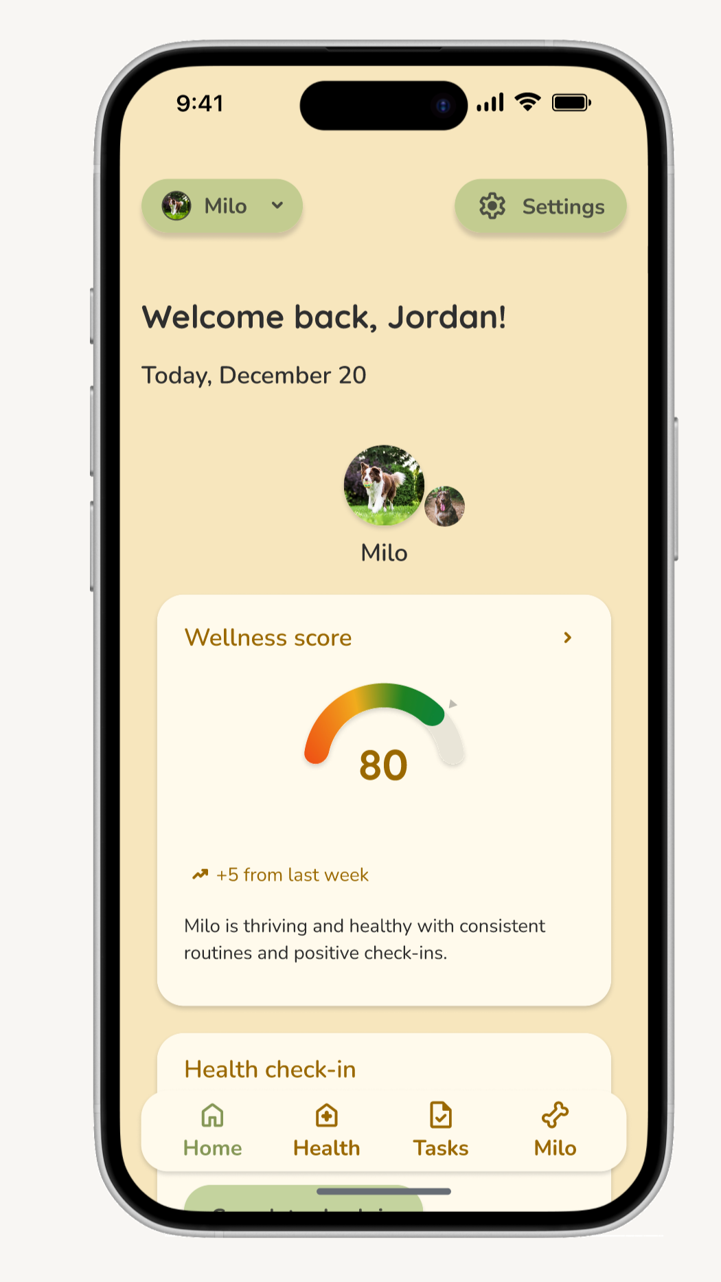
Solution overview: sova is a dog care app designed to help dog owners proactively monitor their dog's daily health through quick check-ins and actionable insights.
Final deliverables: Through iterative testing of wireframes and prototypes, I created a user persona, user flows, high-fidelity prototypes, a complete UI kit, and a brand identity that transforms scattered observations into meaningful health insights.

The problem
Dog owners are naturally attentive to their pets' well-being. They notice when their dog’s energy levels dip, appetite changes, or behavior seems off. Professional veterinary guidance emphasizes that engaging owners in sharing specific observations, such as a mild but noticeable increase in thirst and urination, can prompt earlier diagnostic screening and better long-term outcomes¹. Yet without a structured way to track these daily observations, owners rely on memory alone to detect patterns. Over time, subtle changes go unnoticed, gradual shifts slip through the cracks, and when it's time to visit the vet, owners struggle to provide the concrete, time-anchored details that could help diagnose problems faster. This gap between caring deeply and having the tools to act on that care leaves owners uncertain about whether their dog is truly thriving.
Source¹: Ostermeier, N. (2022, August 9). How collaborating with pet owners leads to better veterinary patient outcomes. The Vetiverse. https://www.thevetiverse.com/en/latest/how-collaborating-with-pet-owners-leads-to-better-veterinary-patient-outcomes/
User research methodology
My primary research focused on the following:
Conducted remote interviews with 5 dog owners, exploring four key areas: their goals and priorities as pet owners, their current behaviors around daily care and memory capture, the workarounds and tools they use (or don't use) to track health and routines, and their biggest frustrations—what feels hardest to stay on top of and why. Questions ranged from "What does being a good dog owner mean to you?" to "How do you handle your dog's daily care needs (feeding, walks, vet appointments, grooming, etc.)? Do you have any systems or methods for managing these?"
Identified key competitors (Woofz, DogNote) and an indirect competitor (Apple Notes) to uncover gaps in existing solutions and opportunities for sova to differentiate itself
Key interview insights
Owners maintain regular feeding and walking schedules but struggle with tasks like grooming and training.
Every participant captures memories through phone photos, but no one uses dedicated apps. Photos remain scattered without context.
Owners monitor well-being through everyday behavioral cues—energy levels, appetite, and bathroom habits—rather than structured tracking.
Opportunities uncovered
Quick daily health check-ins: Create a simple way for owners to log health observations, transforming casual observations into trackable data.
Competitive analysis
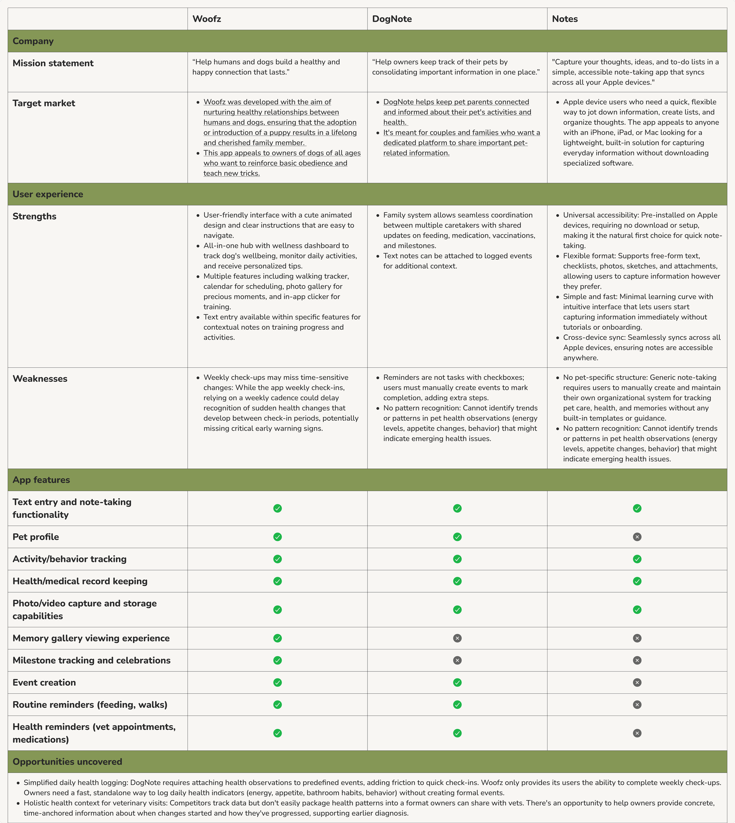
Synthesis process
After completing interviews and competitive analysis, I used affinity mapping to organize findings into thematic clusters. This process revealed clear patterns: owners naturally observe their dogs' health daily through behavioral cues (energy, appetite, bathroom habits) but lack a structured system to capture these observations over time. While they're deeply motivated to be proactive about their dog's health, current solutions create friction.
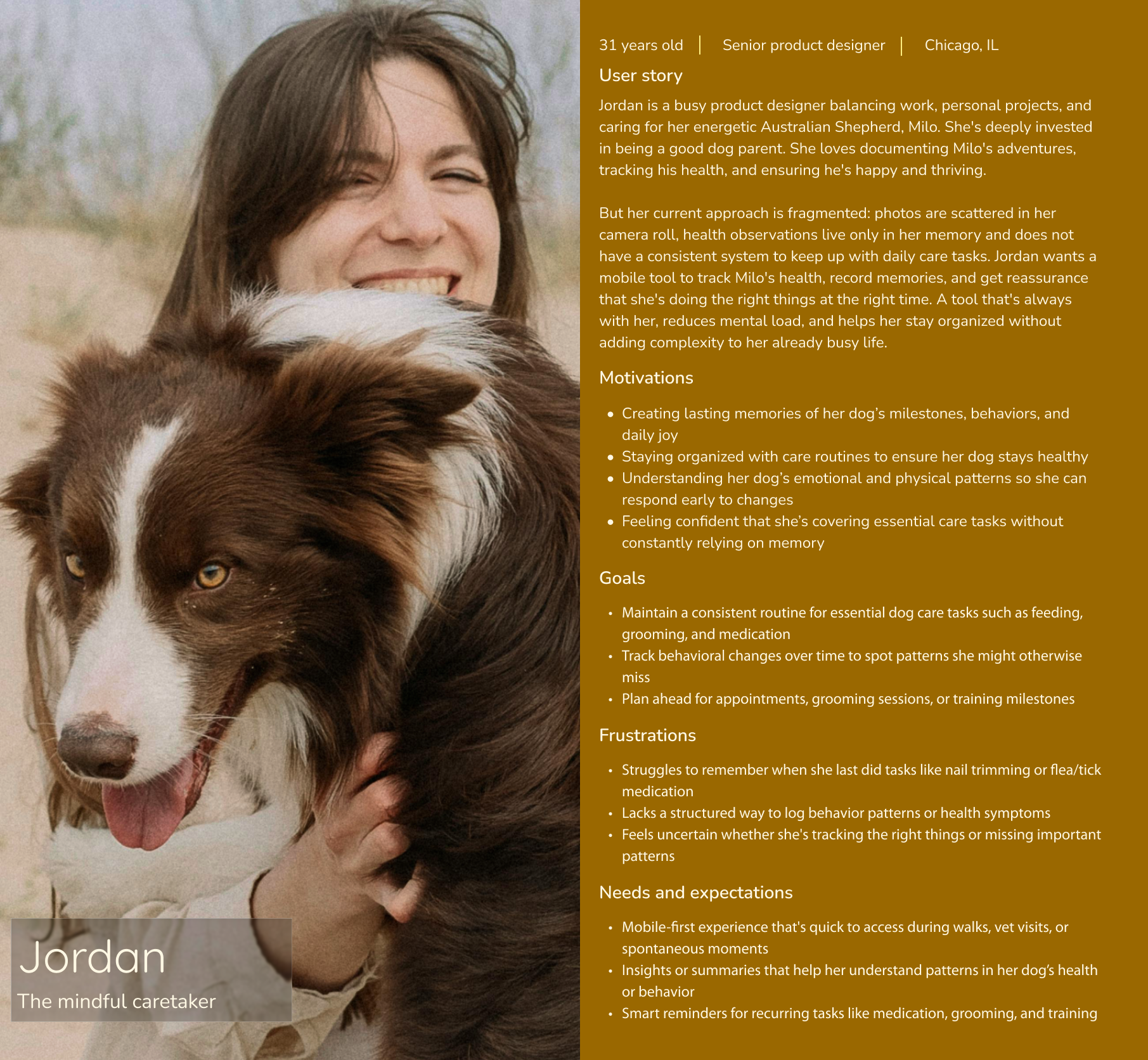
User persona
Problem framing
From the research themes, I developed a Point of View statement:
Dog owners need a simple, quick way to log daily health observations and visualize patterns over time because memory-based health monitoring makes it difficult to spot gradual changes, leading to missed early warning signs and uncertainty about whether their dog is truly thriving.
This led to several How Might We questions:
How might we help owners provide concrete, data-backed information to vets?
How might we make tracking their dog care feel rewarding rather than burdensome for dog owners?
How might we make it quicker to log daily health observations at the moment?
How might we surface patterns and alert owners to meaningful deviations without causing anxiety?
How research inspired the solution
The research and user persona directly shaped Sova's core features:
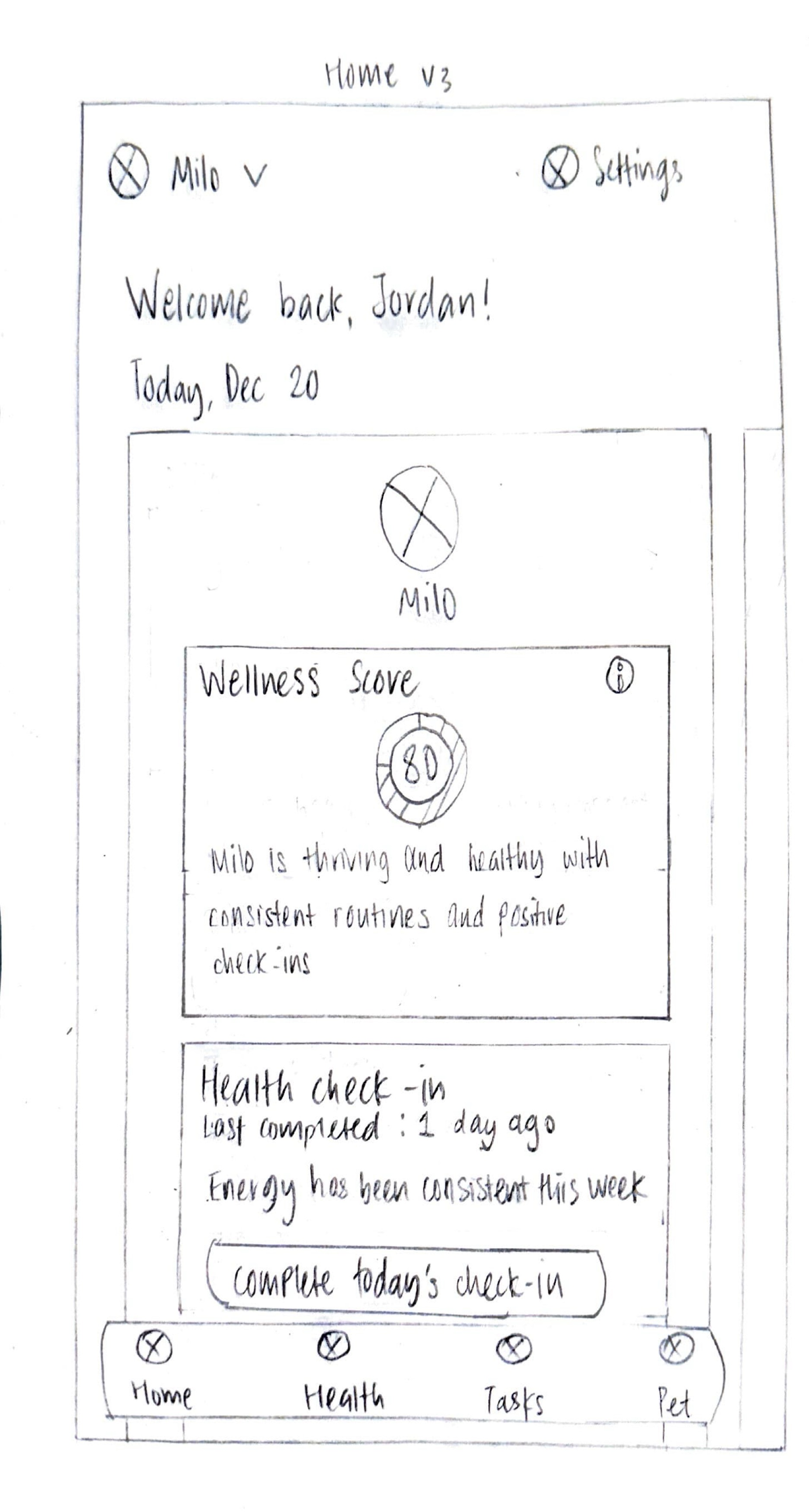
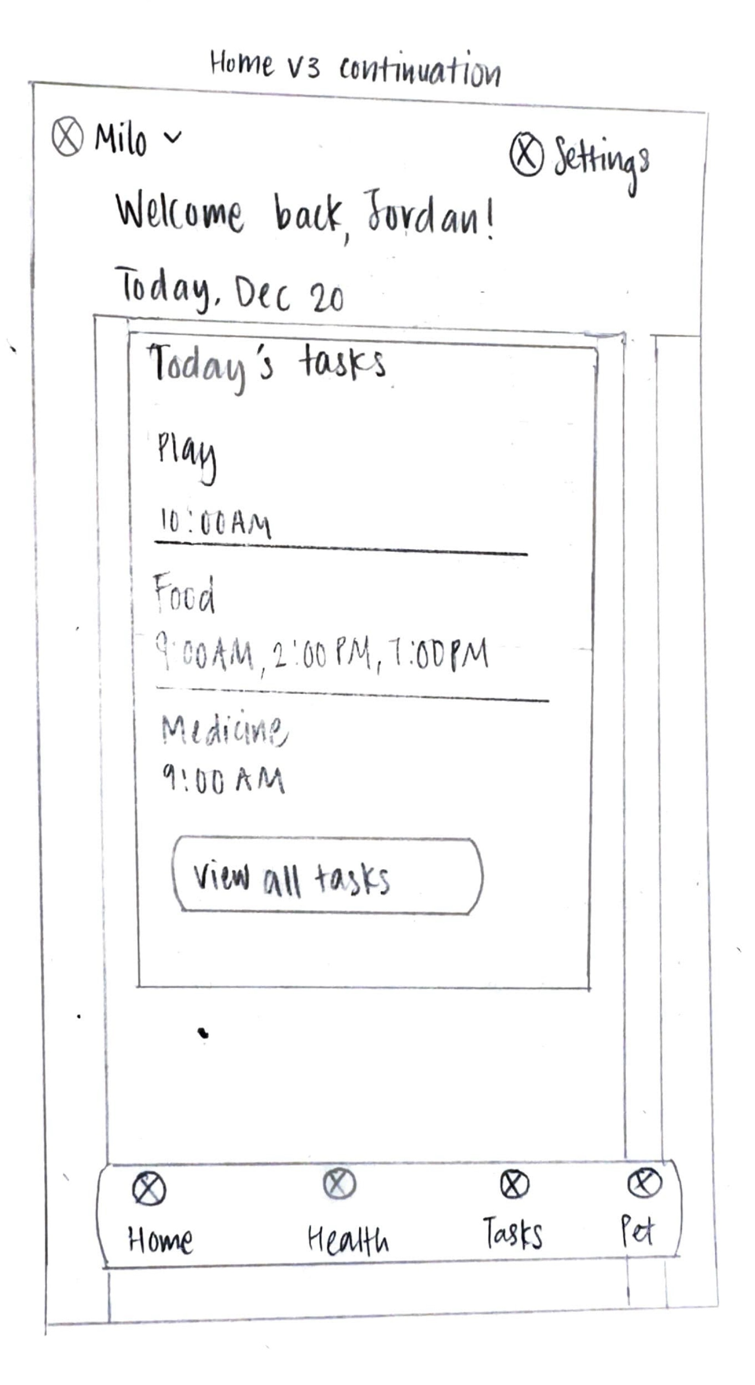
Quick daily health check-ins: Dog owners observe health indicators throughout the day but don't have time for lengthy logging. I prioritized a fast check-in feature.
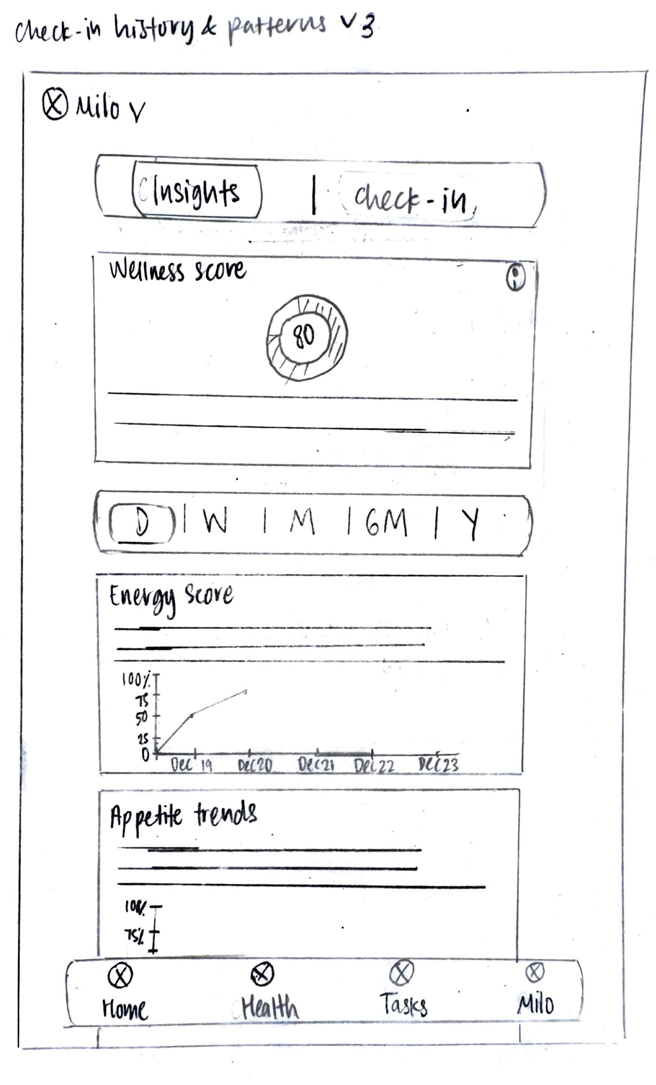
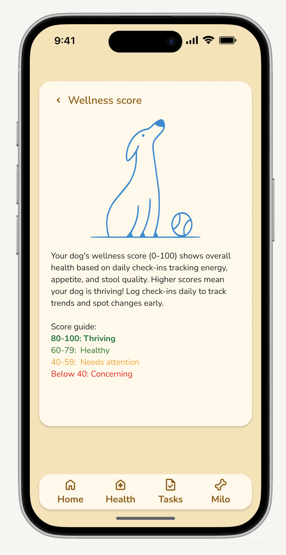
Pattern visualization and insights: Owners tend to struggle to remember specific details or notice gradual changes. I designed health insights that surface trends over time, helping them spot deviations.
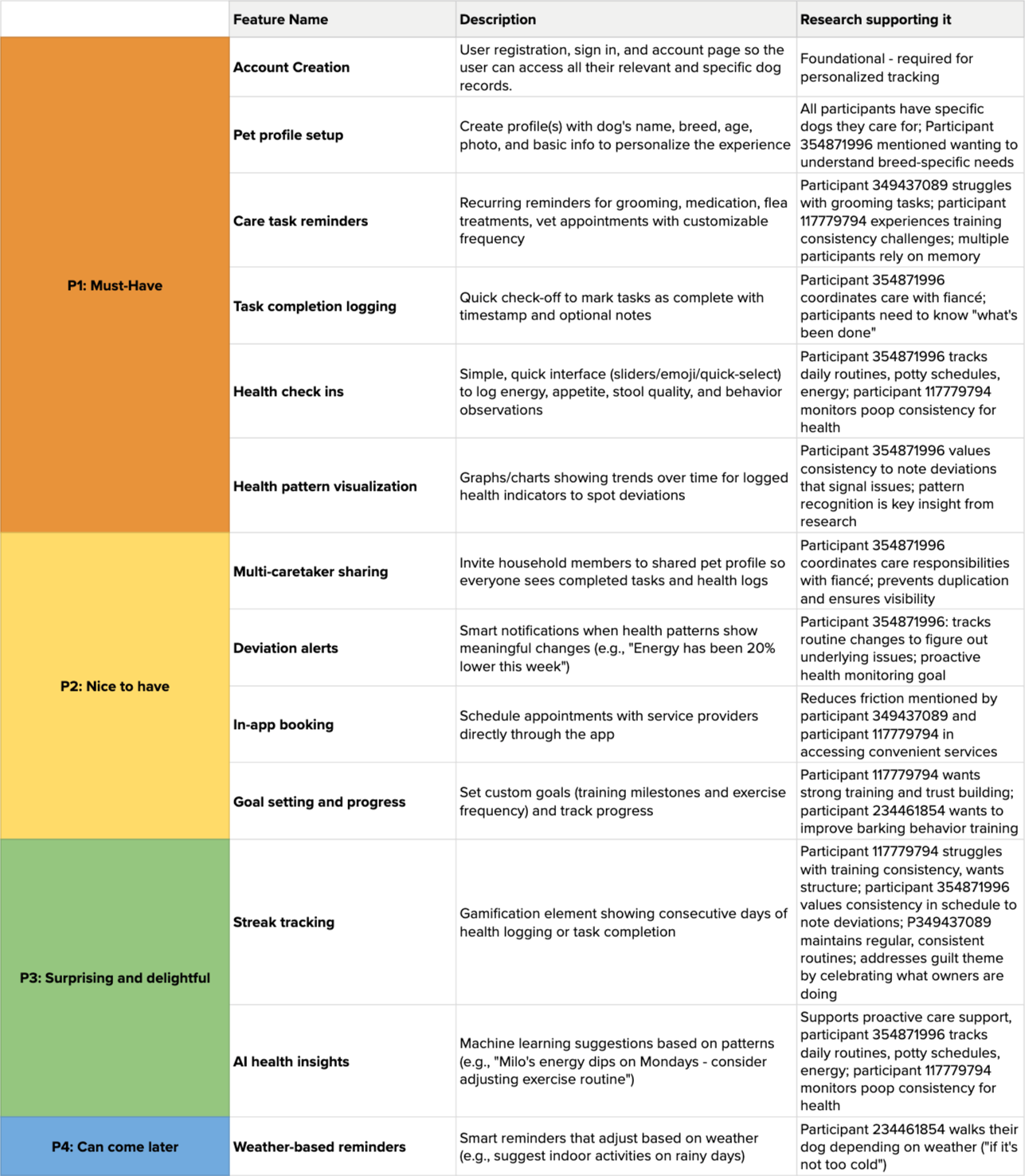
Feature roadmap
Sitemap
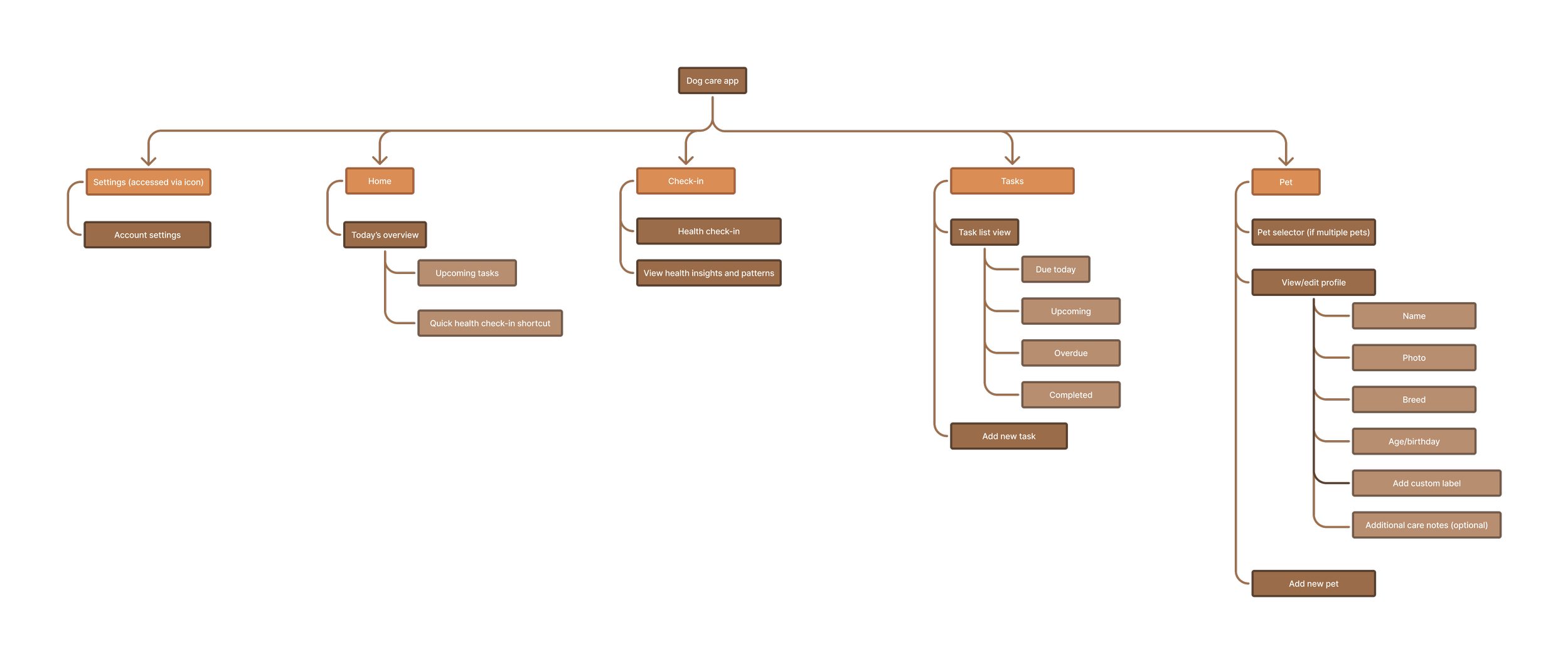
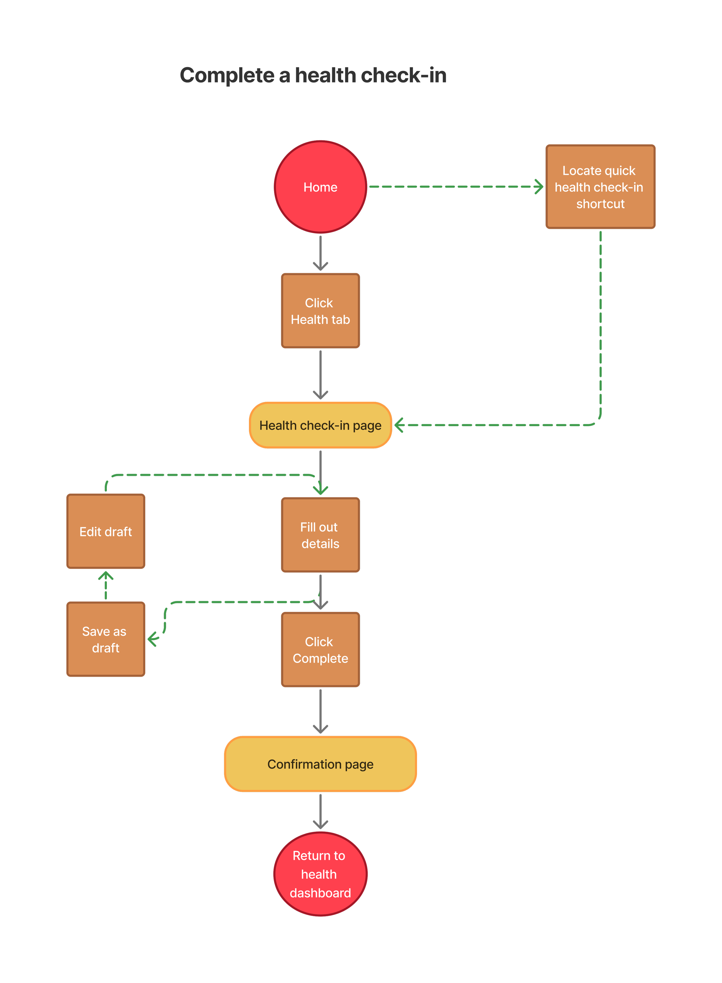
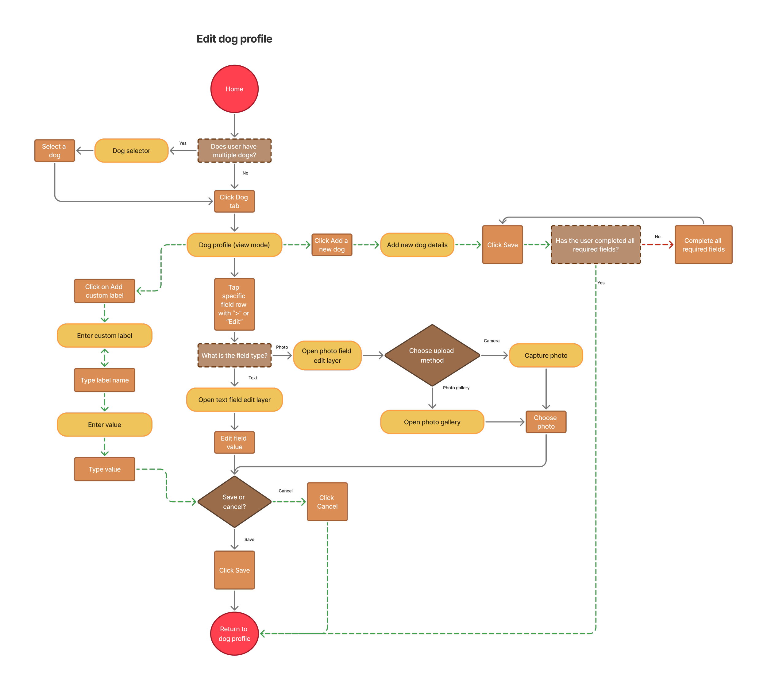
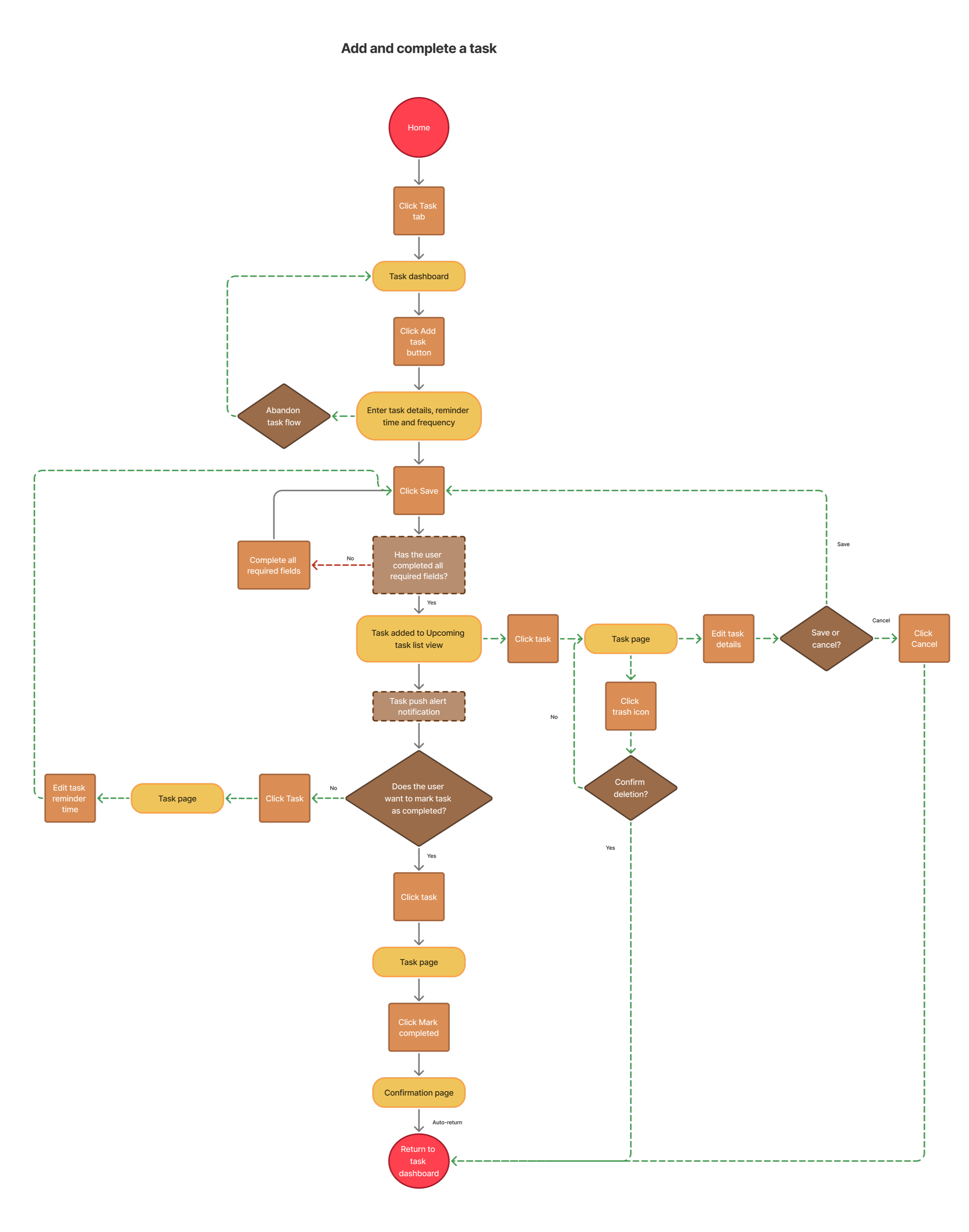
User flows
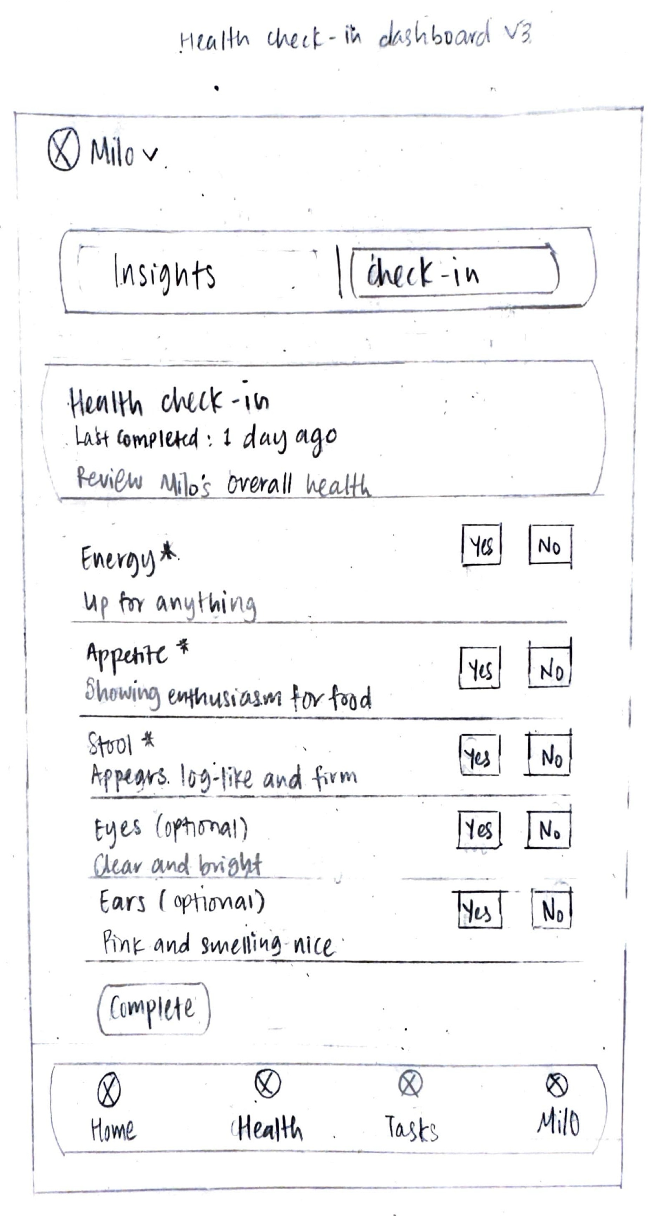
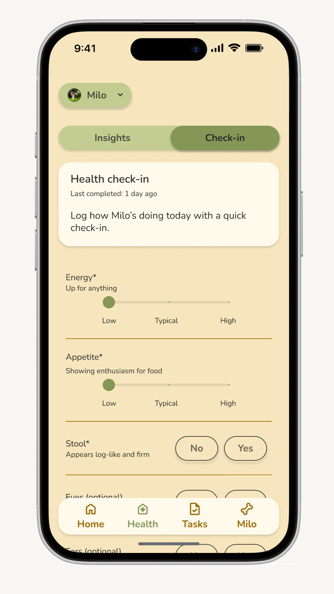
I focused on creating user flows for three core interactions: the check-in process for logging daily health observations, adding and completing a task, and editing a dog profile. These flows were designed to be as frictionless as possible to help them avoid abandoning the process.
Branding
I developed Sova's brand identity to feel modern and clean without being sterile, using warm neutrals and gentle pastels to create a calm, trustworthy experience.
Brand elements:
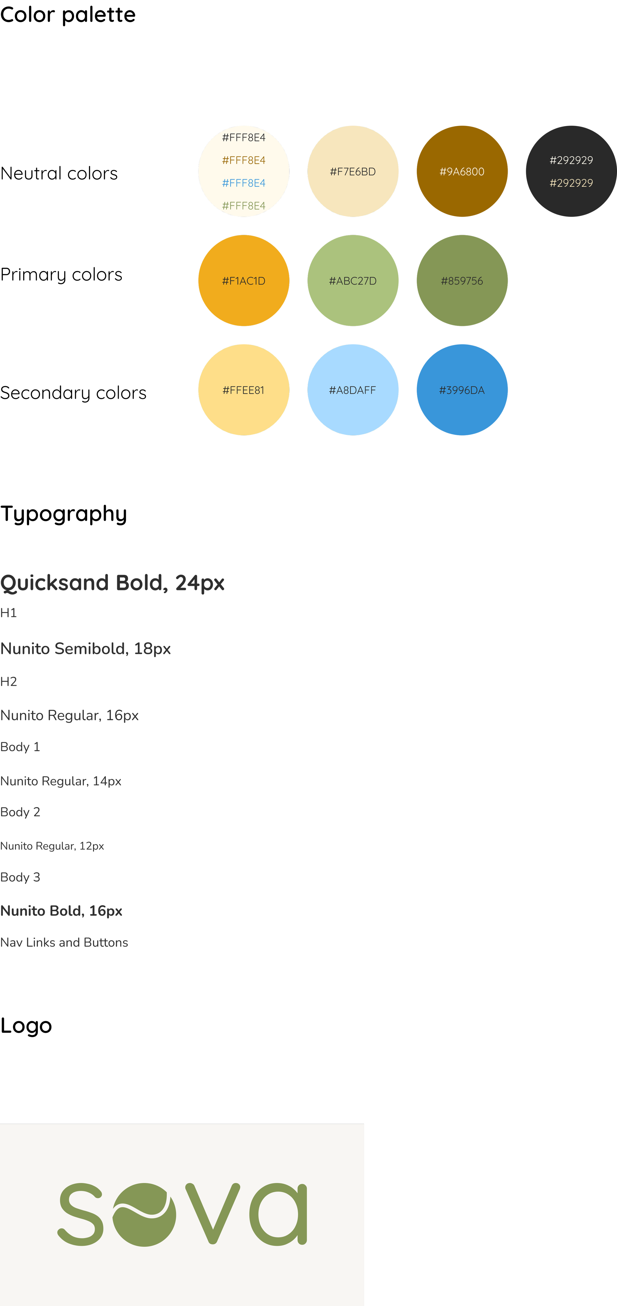
Color palette: Warm neutrals combined with sage greens and sunny yellow evoke nature and vitality, while soft blues add calming accents.
Typography: Quicksand for headings paired with Nunito for body text balances approachability with excellent readability for health data.
Logo: The sova wordmark incorporates a playful tennis ball as the "o," subtly referencing the joy of dog ownership while maintaining a clean, contemporary aesthetic.
Wireframing process
I started with low-fidelity sketches on paper to quickly explore different layout options and interaction patterns without getting attached to any particular design. Once I had a clear direction, I moved into Figma to create high-fidelity wireframes. For each key screen, I created two versions and brought them to group critiques for feedback. This iterative approach helped me refine the information hierarchy, ensure the check-in flow was intuitive, and validate that the health insights were easy to understand at a glance.
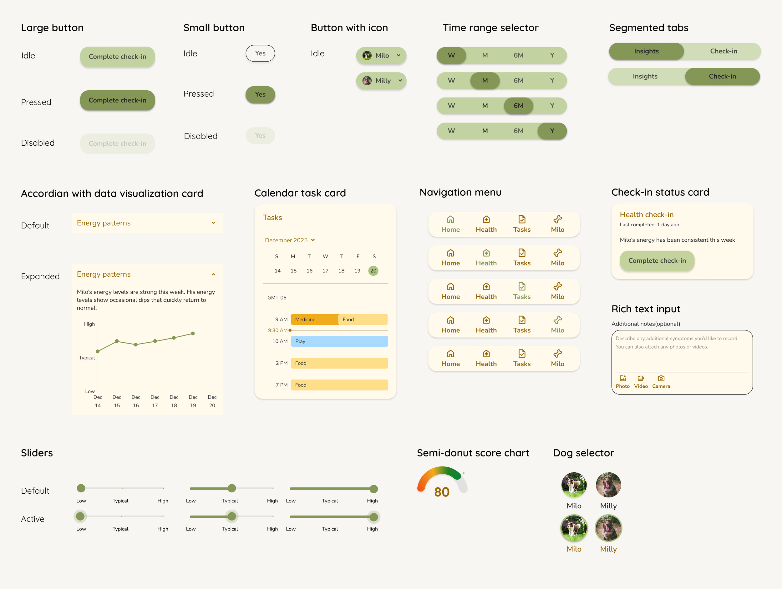
UI kit
Usability test overview
The usability test evaluated the mobile experience of Sova, an app designed to help dog owners proactively monitor their dog’s daily health indicators through quick check-ins and health insights. The goal of this study was to understand how easily users can navigate the health check-in feature, interpret insights, and perceive value from health tracking over time.
Usability test participants
Total participants: 5
Participants were dog owners who:
Own one or more dogs
Regularly observe their dog’s behavior or health indicators
Have busy or demanding schedules
Use mobile apps comfortably
Usability test findings
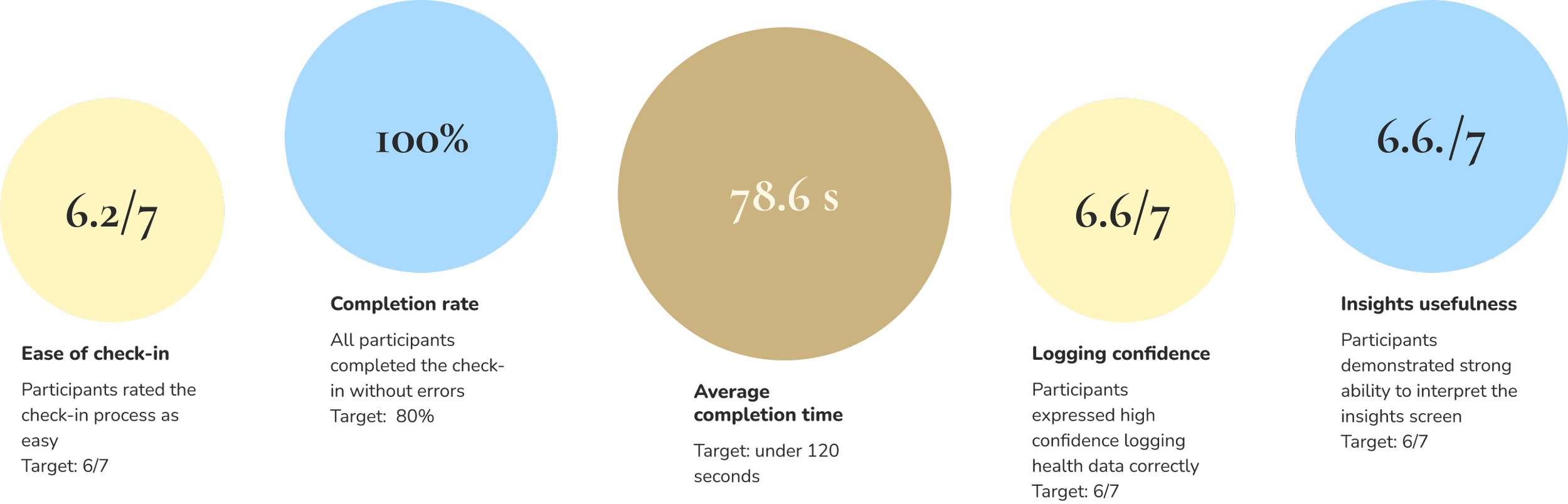
60% of participants reported confusion (target: under 20%)—though feedback revealed this stemmed from uncertainty about the hypothetical task scenario rather than the interface itself. One participant noted: "Filling the check-in itself, I was unsure of the condition of the dog or if it was even relevant."
What’s working well
1. Check-in task clarity and effectiveness
100%
Task completion rate
6.2/7
Logging confidence
6.6./7
Ease of check-in
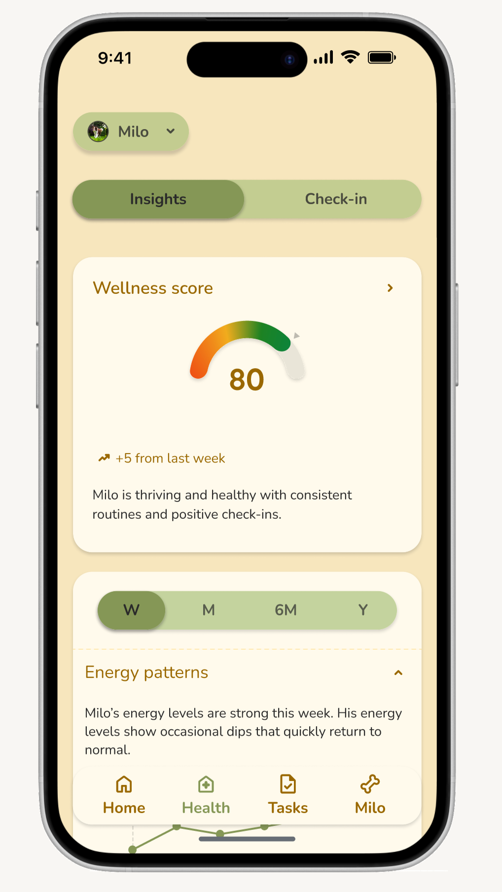
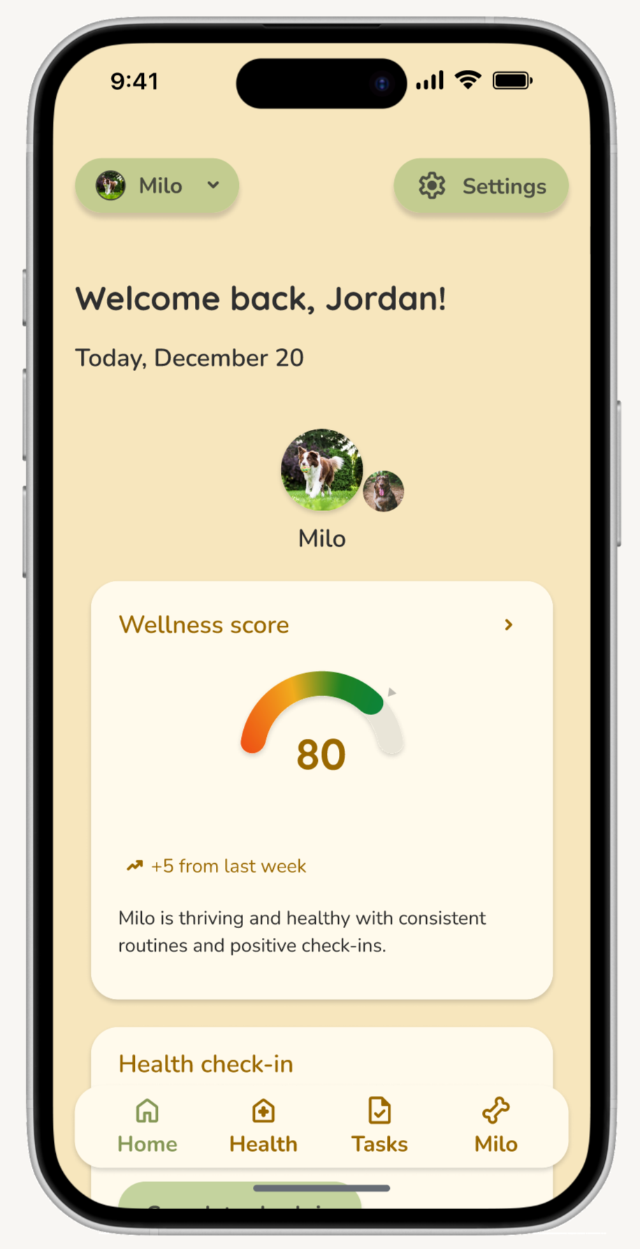
The daily health check-in flow performed well, with participants rating the check-in process as both clear and easy to complete. They expressed confidence that they had correctly logged their dog’s health. This validates that the core logging flow is intuitive and aligns with how owners naturally assess their pet’s wellbeing.
2. Insight interpretation and value recognition
6.6./7
Insights usefulness
Participants demonstrated a strong ability to interpret the Insights screen and articulate what the data meant about their dog’s health. Users described improvements over time, identified wellness trends, and assessed condition changes without additional guidance.
Comments such as “It covers several patterns including energy, appetite, etc, presented in diagram, clearly showing the trend” and “Everything falls within the typical range… there are no immediate concerns about Milo” confirmed that visualizations successfully translated tracked data into a meaningful health context. Insights were rated as highly useful for monitoring long-term health, supporting sova’s value proposition around proactive awareness.
3. Alignment with proactive health goals
6.4/7
Long-term value
Participants recognized the benefit of logging over time and expressed confidence in understanding the long-term purpose of continued tracking. Many noted that the system painted a clear picture of their dog’s status and trajectory, validating that sova helps fill the current gap where owners rely on memory to detect subtle changes.
Iteration recommendations
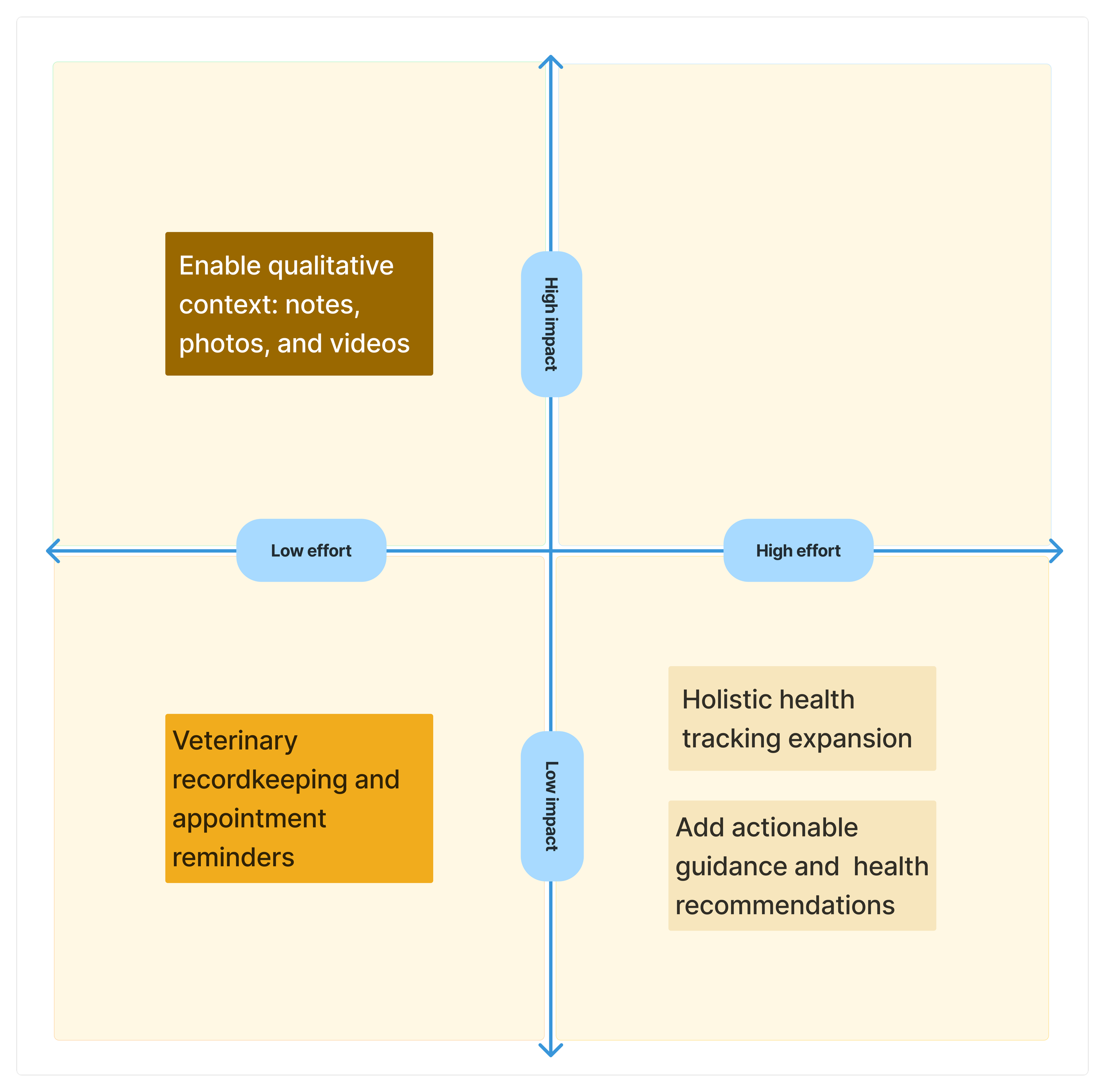
Add action-oriented guidance
One participant requested guidance on what to do when health metrics fall outside typical ranges. They wanted tips for improving wellbeing, alerts when veterinary care may be needed, and clearer thresholds for what constitutes a concern.
Incorporate veterinary recordkeeping and scheduling features
One participant highlighted interest in tracking veterinary appointments and preventive care.
Expand the health data model to include related contextual factors
One participant expressed interest in tracking diet, exercise, and vital signs to create a more complete picture of their dog’s health.
Enable richer documentation through notes, photos, and videos
Two participants asked for ways to add qualitative context, such as notes or media attachments. This would support owners in capturing nuances that structured fields cannot and would enhance the detail available for veterinary consultations.
Recommendation priority:
Immediate priority: Prioritize high-impact, low-effort improvement to support notes and media attachments within the check-in flow. This will improve documentation accuracy and give users more flexibility when logging health observations.
Future consideration: Revisit higher-effort features such as actionable health guidance, veterinary recordkeeping, and holistic health tracking after validating core adoption and if future research indicates stronger user demand.
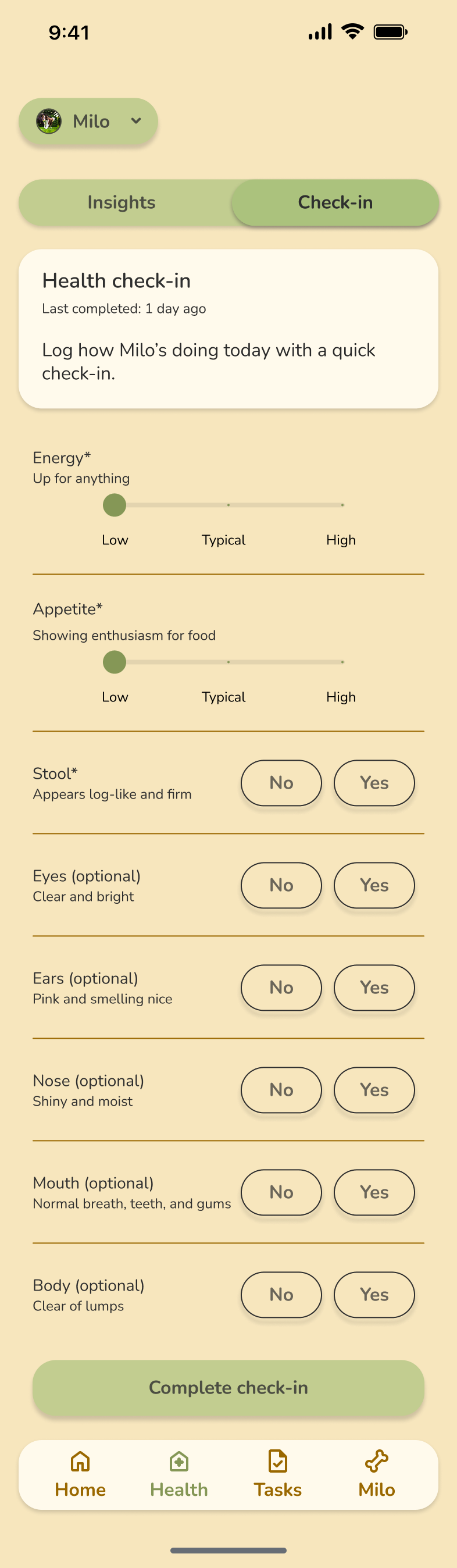
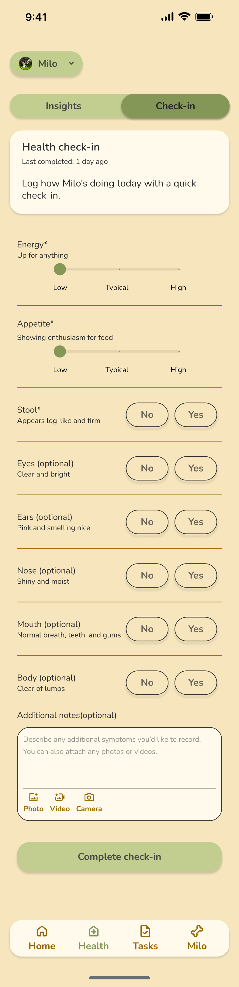
Iterations
Enable richer documentation through notes, photos, and videos
Problem Identified:
Participants from the usability test wanted the ability to attach notes and media to better capture nuances during check-ins. This feature delivers meaningful value for veterinary conversations and tracking health patterns over time, while requiring relatively low development effort.
Solution Implemented:
Added an "Additional notes (optional)" text field below the check-in questions.
Included the ability to upload photos and videos or capture them directly using the camera, allowing users to type and attach in the same space.
Maintained the optional nature of this feature to avoid adding friction to the check-in process.
Results:
Users can now capture nuances and document their dog's well-being more comprehensively within the app itself, creating a richer record for veterinary visits and pattern identification.
Before
After
Prototype
Conclusion
Key challenges and learnings
Designing informative insights without causing anxiety: One challenge was presenting health insights in a way that felt helpful rather than alarming. Because dog health data can be sensitive, overly definitive language or visuals risked increasing user anxiety. I learned to frame insights around neutral patterns and trends instead of conclusions, using supportive language and visual cues that encouraged observation rather than urgency.
Balancing speed with meaningful data capture: Another challenge was designing a daily check-in experience that was fast enough to fit naturally into users’ routines while still capturing useful health information. I learned that prioritizing low-friction interactions, such as simplified inputs and minimal required fields, was key to encouraging consistent usage. Over time, repeated lightweight check-ins proved more valuable than attempting to collect detailed data in a single session.
Avoiding cognitive overload in the check-in flow: There was a risk of overwhelming users by presenting too many metrics, explanations, or options at once. I learned the importance of surfacing only what was necessary in the moment and allowing deeper insights to be explored later. This helped keep the experience calm and approachable while still supporting more engaged users who wanted additional context.
What I’d approach differently
Avoid assuming the solution too early
Early in the project, I assumed the solution would be a journaling app where dog owners could record memories in one place. Through research, I learned that this was not a strong user need as dog owners were far more motivated by tools that help them monitor and understand their dog’s health. This reinforced the importance of letting research shape the problem space before committing to a solution direction.Validate language and tone earlier with users
I would test the language and tone used in health insights earlier in the design process to ensure they felt supportive, clear, and non-alarming. Because health-related information can easily be misinterpreted, earlier validation of wording and labels could have helped confirm that insights were reassuring and actionable without increasing anxiety.