
Project details
Duration: 8 weeks
My role: Sole product designer responsible for the UX/UI process, from initial research and persona development through final prototyping (independent project, not affiliated with OpenTable)
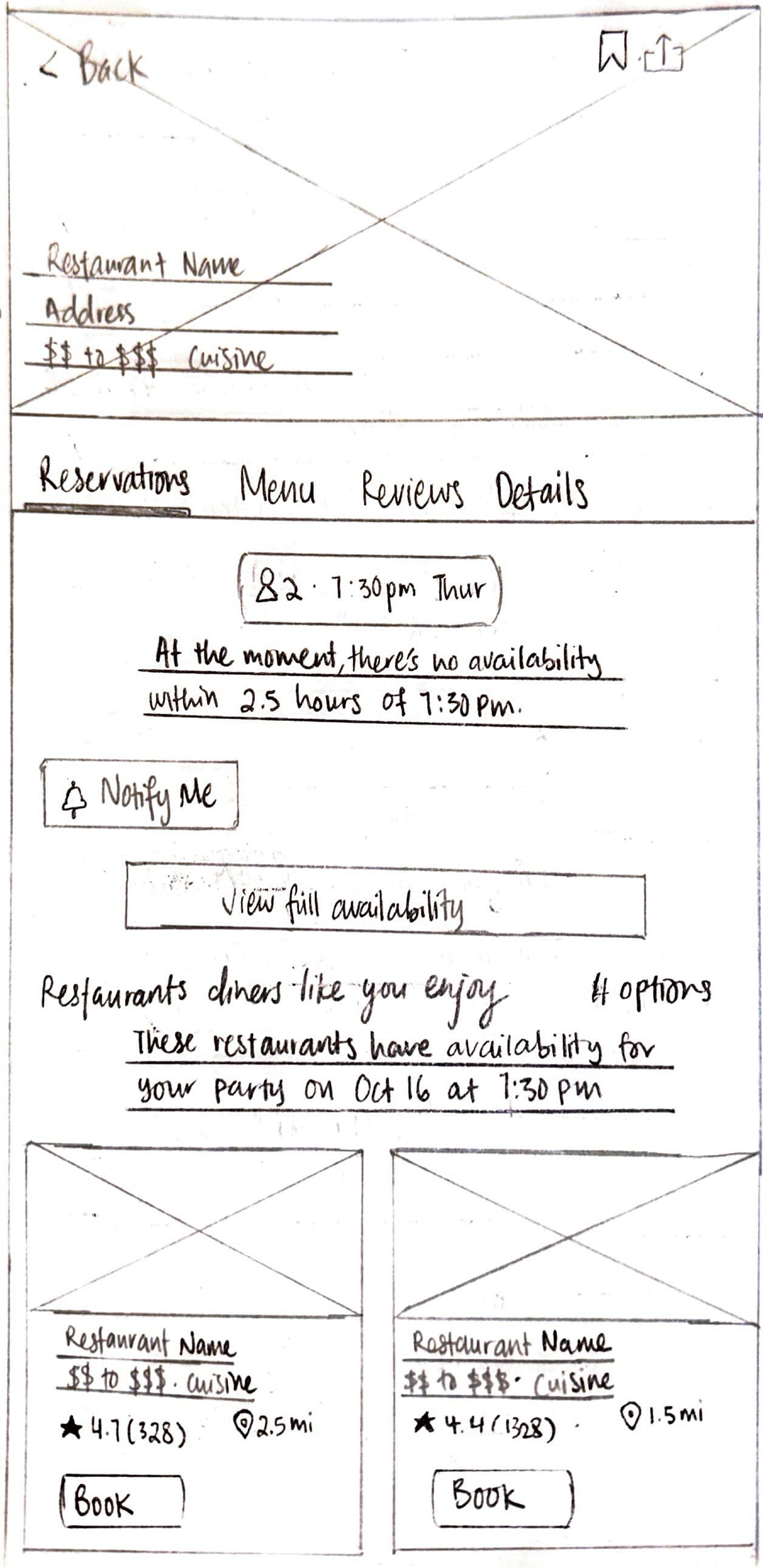
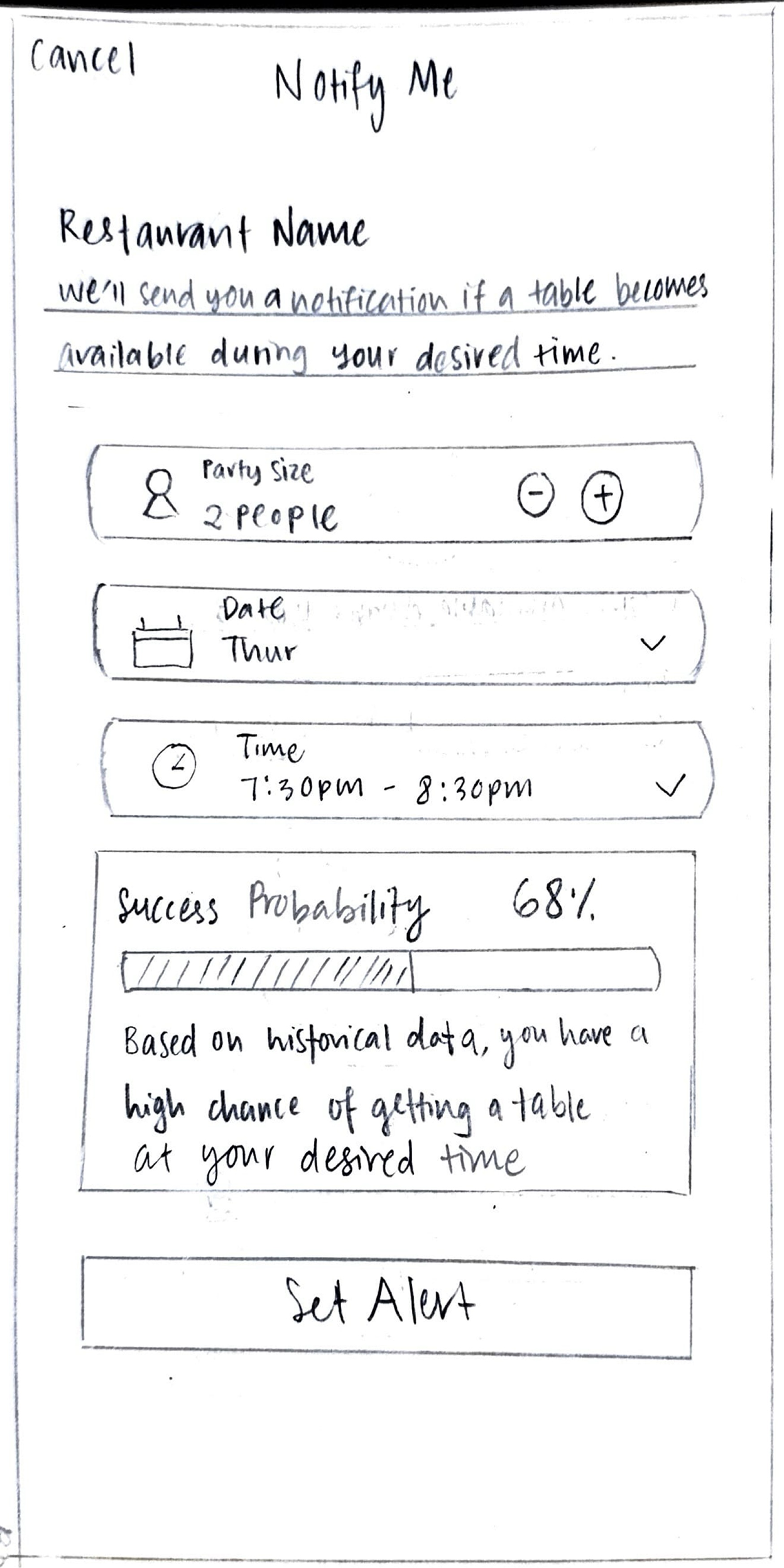
Solution overview: The new "Notify Me" feature transforms the reservation experience for OpenTable users by providing real-time probability percentages of securing a table and AI-powered alternative suggestions, giving users clarity and control in an otherwise unpredictable reservation process.
Final deliverables: Through iterative testing of wireframes and prototypes, I created a user persona, user flows, and high-fidelity prototypes, following OpenTable's branding and UI kit closely to demonstrate how transparency and predictive insights can reduce booking anxiety and empower diners to make confident decisions.
The problem
In 2025, 54% of Americans said they plan to eat out more frequently. Younger generations are leading this charge—71% of Gen Z and 68% of Millennials expect to increase their restaurant visits¹.
Americans are craving unique, memorable experiences more than ever. OpenTable data shows a 27% increase in Experience dining year-over-year, with 42% of people saying they’ll seek out experiential dining more frequently in 2025. Tasting menus remain the most sought-after dining experience, followed closely by dinner-and-show combinations and bottomless brunch¹.
However, high-demand restaurants are difficult to book, with reservations disappearing within minutes of being released. The current “first-come, first-served” approach can be exploited by bots and black-market reservation apps, which hoard or resell reservations (e.g., Appointment Trader), harming both restaurants and legitimate diners.
Busy individuals often don’t have the time or flexibility to refresh apps or check for last-minute cancellations. Current systems also lack transparency about where users stand in the waitlist, leading to frustration and uncertainty. While services like Amex Concierge help with booking, they don’t have real-time visibility into waitlists and often miss time-sensitive reservation releases.
Source: ¹ OpenTable. "2025 Hospitality Trends: What Diners and Restaurants Can Expect." https://www.opentable.com/restaurant-solutions/resources/hospitality-trends/
Who I was solving for
My primary focus was on the following user groups:
Time-constrained diners seeking efficient booking experiences on OpenTable
Food enthusiasts who are pursuing high-demand restaurants and exclusive dining experiences
User research methodology
My primary research focused on the following:
Conducted interviews with diners to understand how they currently try to book reservations at high-demand restaurants using OpenTable and other platforms. The goal is to identify the biggest challenges, frustrations, and unmet needs in the reservation process, and to uncover opportunities for a new OpenTable feature that could make the experience more convenient, transparent, and enjoyable.
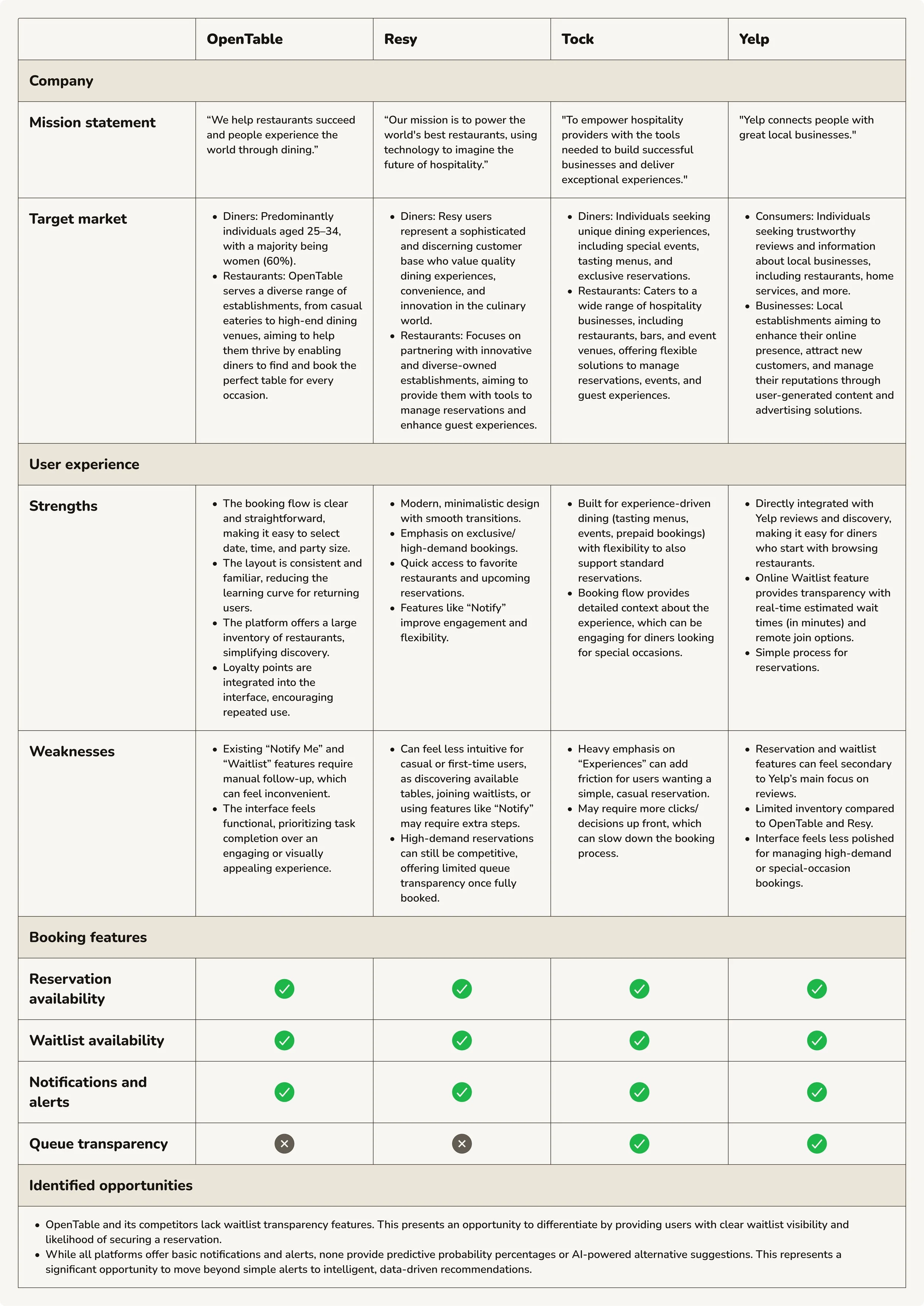
Identified key competitors in the online restaurant-reservation service space and indirect competitors to analyze their feature sets, booking workflows, waitlist management capabilities, and transparency mechanisms. This competitive analysis helped uncover gaps in the market and opportunities for a new OpenTable feature to differentiate itself through enhanced user experience and functionality.
User interview participants
Total participants: 6
A diverse range of diners who book reservations through OpenTable, varying in geographic location, age, and gender.
Frequent restaurant bookers who regularly attempt to dine at high-demand or popular restaurants (at least once a month)
Key interview insights
Multi-channel booking approach: Users employ both digital and traditional methods for securing reservations at high-demand restaurants. They combine app-based monitoring with phone calls, using calls as both a primary strategy for immediate availability and a backup when digital channels fail to deliver results.
Limited success with current features: Users are aware of and utilize OpenTable's existing Notify Me feature, but report mixed results and low success rates. The lack of transparency about their position or likelihood of success leaves them uncertain whether to continue waiting or pursue alternatives.
High demand for visibility and control: Users strongly value transparency in the reservation process, particularly knowing where they stand on waitlists and their realistic chances of securing a table. Without predictive information, they waste time monitoring reservations that may never materialize, leading to frustration and lost opportunities.
These insights shaped my design direction for OpenTable: a transparent waitlist feature that displays probability percentages upfront and provides AI-powered alternative suggestions, empowering users to make informed decisions before committing their time to a waitlist.
Competitive analysis
Synthesis process
After completing interviews with 6 participants and competitive analysis, I used affinity mapping to organize findings into thematic clusters around: multi-channel booking behaviors, waitlist and notification feature usage, transparency and confidence issues, time sensitivity in securing reservations, and emotional responses to booking uncertainty. Participants included a diverse range of diners from different geographic locations, ages, and genders—all frequent restaurant bookers who regularly try to dine at high-demand or popular restaurants at least once a month.
This process revealed a critical pattern: diners use multiple channels (OpenTable, phone calls, direct restaurant contact) to secure reservations, but lack transparency about their waitlist position and realistic chances of success. While they're aware of existing Notify Me and Waitlist features, these tools don't provide the visibility they need to make informed decisions about whether to keep waiting or pursue alternatives.
User persona
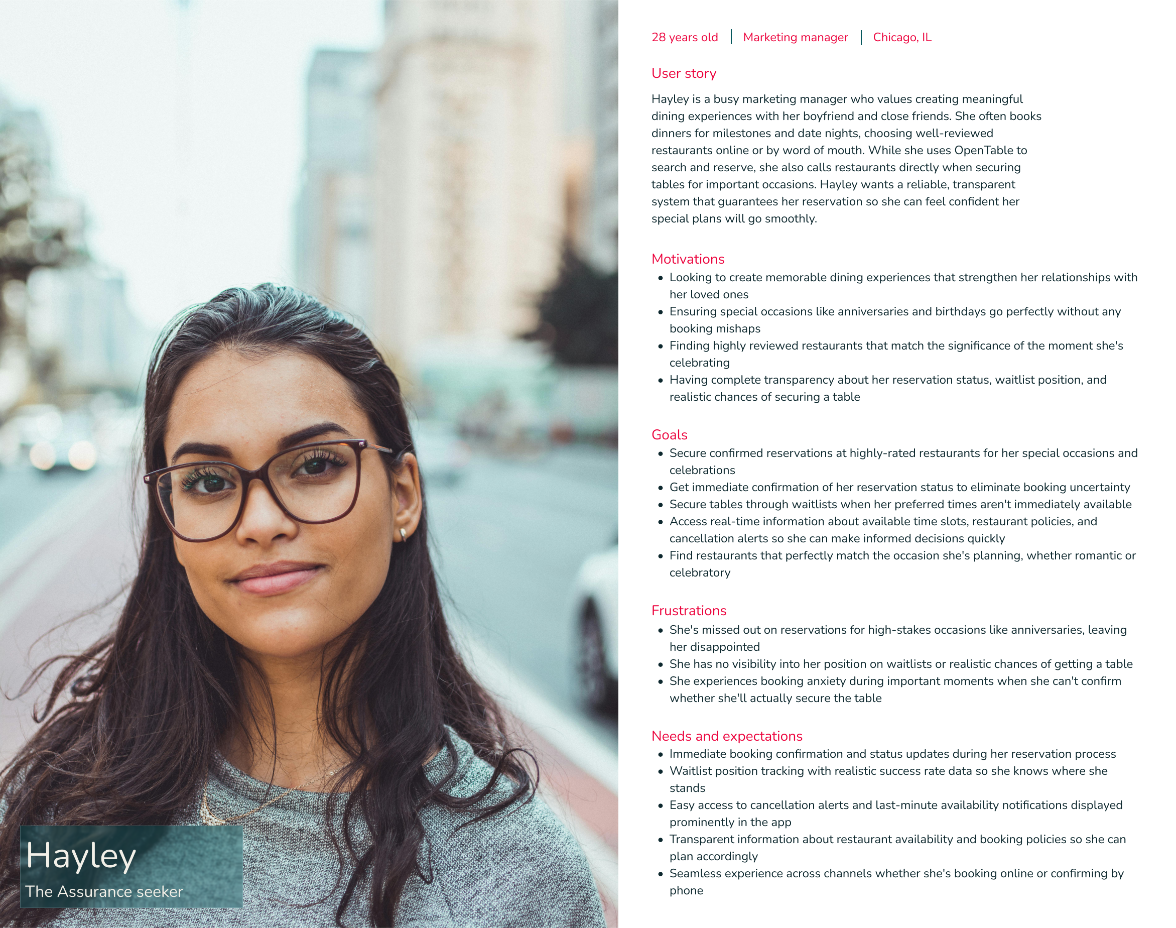
Problem framing
From the research themes, I developed a Point of View statement:
Diners need complete transparency about their reservation status, waitlist position, and realistic booking chances because uncertainty about securing tables for meaningful moments causes anxiety and forces them to seek confirmation through alternative channels.
This led to several How Might We questions:
How might we provide real-time waitlist position tracking so users know exactly where they stand when they try to book a reservation?
How might we display historical success rates for waitlists to set realistic expectations?
How might we create dynamic availability updates that keep users informed of their booking chances?
How might we design reassuring status messages that reduce anxiety during the booking process?
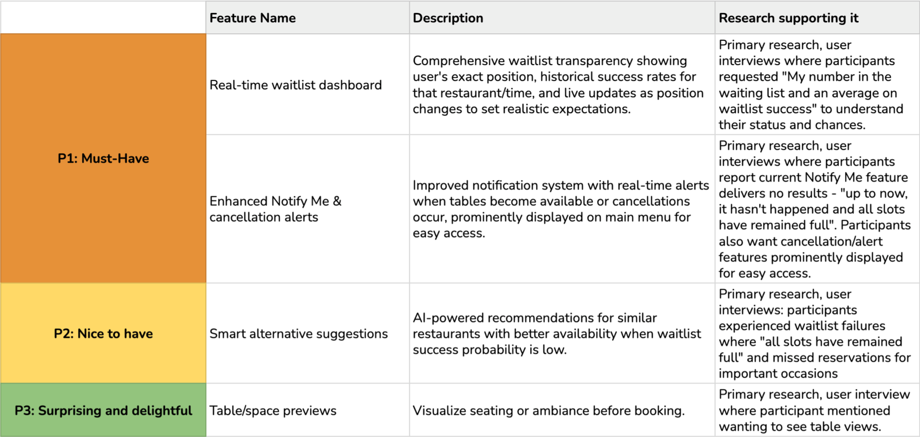
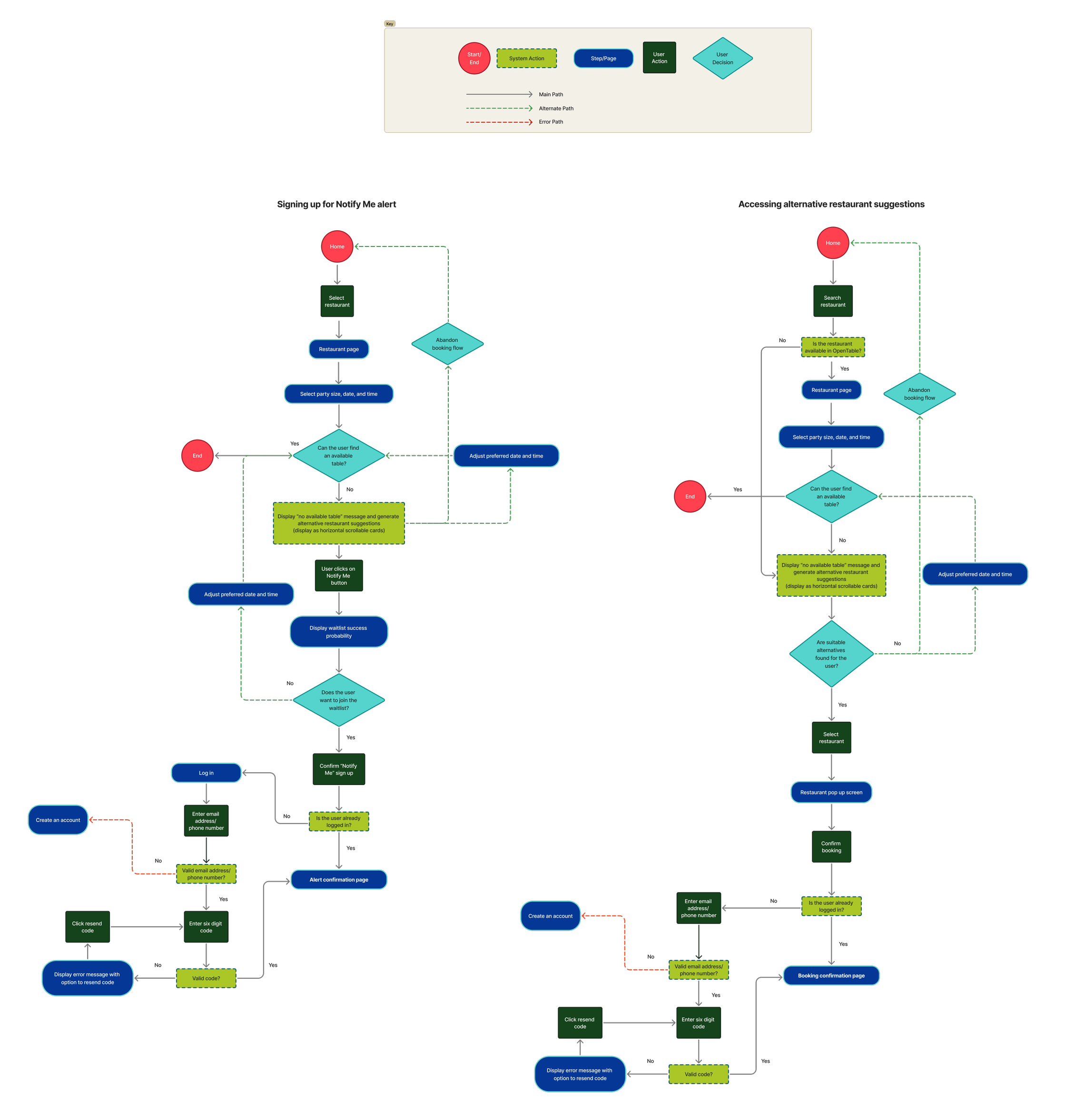
Feature roadmap
User flows
Usability test overview
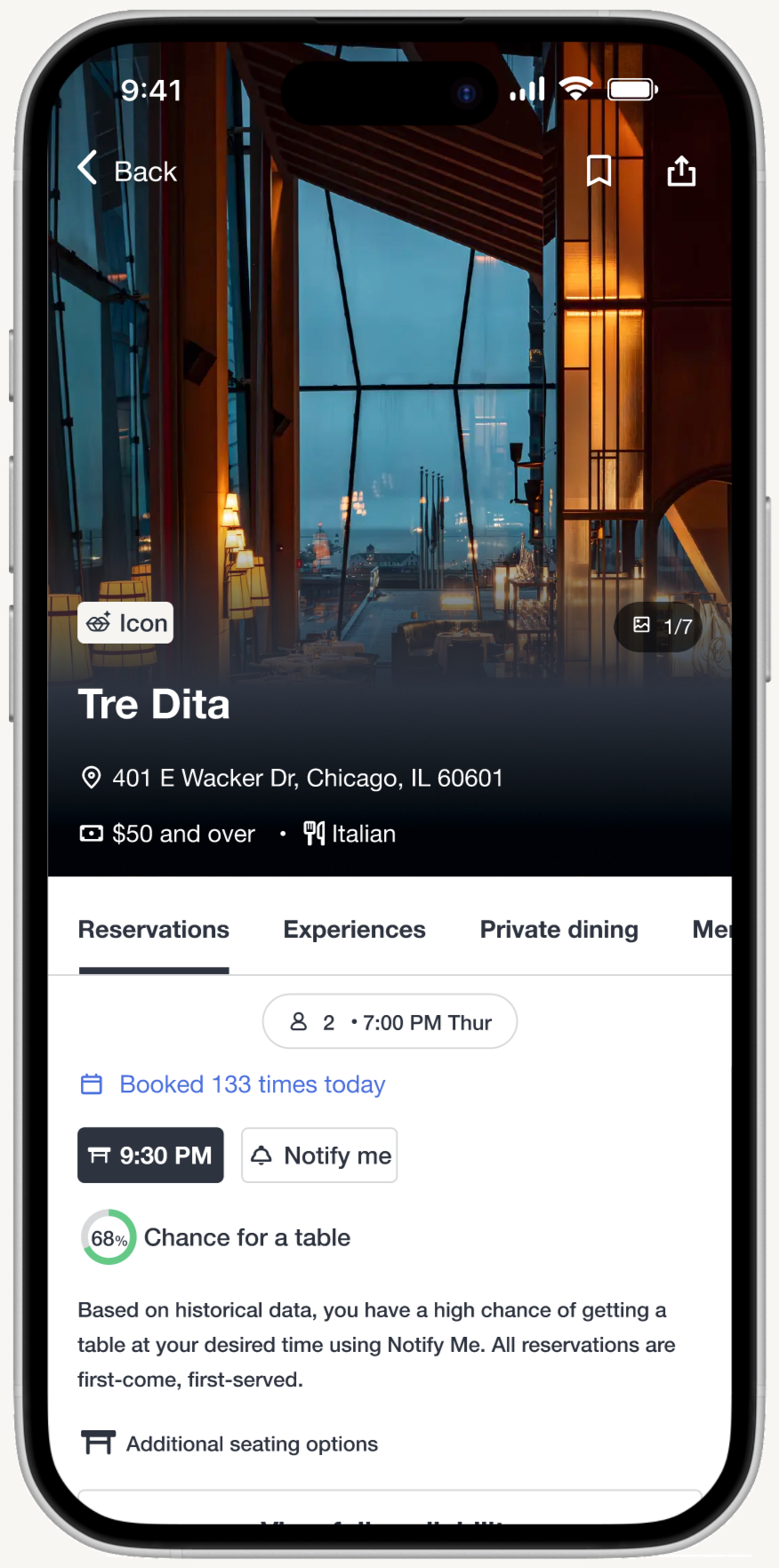
The usability test evaluated the mobile experience of OpenTable’s new Notify Me feature for fully-booked restaurants. The study aimed to determine whether users can effectively understand, navigate, and utilize the Notify Me feature when no tables are available.
The test included two user flows:
Task scenario 1 (happy path): Probability indicator displayed with AI-suggested alternative restaurants
Task scenario 2 (edge case): Probability unavailable, with AI-suggested alternative restaurants
Both flows assessed how users interacted with the Notify Me feature while also considering AI-suggested alternatives.
Usability test participants
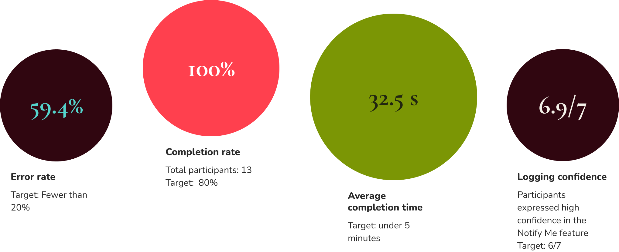
Total participants: 13
Frequent restaurant bookers who regularly attempt to dine at high-demand or popular restaurants
Users who have experienced fully-booked restaurants and had to find alternative times, restaurants, or join waitlists
Users familiar with notification/waitlist features from OpenTable
Usability test findings
Task scenario 1
Task scenario 2
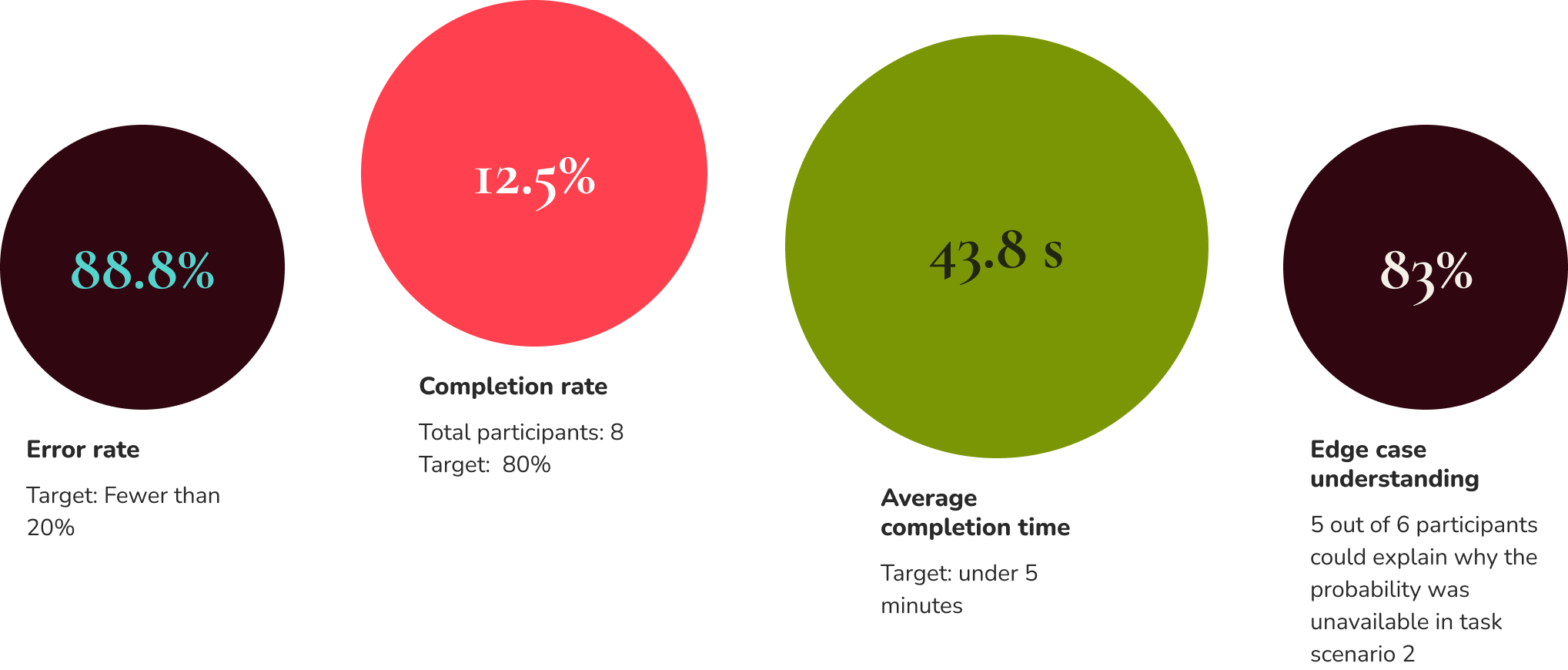
Task completion rate
Task scenario 2 [Notify Me (probability unavailable) + AI suggestions]:
There was an ongoing bug issue with Maze, which prevented several participants from starting the task scenario 2 flow
2. Efficiency
Error rate:
The misclicks aren’t concerning because users weren’t failing; they were just exploring other options. They still easily found and used Notify Me.
3. User experience metrics
Decision path (flow 2 only): Track which option users choose (Notify Me vs. AI suggestions) and their reasoning
Only 1 out of 7 participants chose the AI restaurant suggestion
Our current information hierarchy aligns with the findings, where the AI suggestions are placed lower than Notify Me based on its popularity.
What’s working well
1. Notify Me feature confidence and clarity
32.5s
Average completion time
6.8/7
Clarity of messaging
6.9/7
Logging confidence
100%
Task completion rate
The Notify Me feature performed exceptionally well in Task Scenario 1. Users demonstrated high confidence in their ability to use the feature, with one participant noting, "I didn't feel like any information was missing as the directions were clear," while another stated, "It wasn't missing anything, it was simple." The clarity of information throughout the sign-up process received strong ratings, with participants expressing "nothing, I think it was clear. Because the button was prevalent.”
2. Feature prioritization alignment
7/8
Participants chose Notify Me over AI suggestions
The Notify Me feature emerged as the strongly preferred option over AI restaurant suggestions for the majority of participants when their desired time slot was unavailable. Users explained they picked "Notify me, in case there was a cancellation I will be next in line" and "I used Notify Me to let me know when a table becomes available. I didn't pick the AI because I usually steer away from that form of technology as I enjoy hunting for restaurants myself." This validates the current information hierarchy that positions Notify Me more prominently than AI suggestions.
3. Edge case messaging effectiveness:
83%
Participants displayed edge case understanding
When probability percentages were unavailable (Task Scenario 2), 83% of participants (5 out of 6) correctly understood why this information couldn't be displayed. The majority of users demonstrated solid comprehension of the system's limitations, with explanations like: "the app was not 100% sure they can provide that info" and recognizing that insufficient cancellation data prevented probability calculations. This indicates the messaging successfully communicated technical constraints in user-friendly terms.
Iteration recommendations
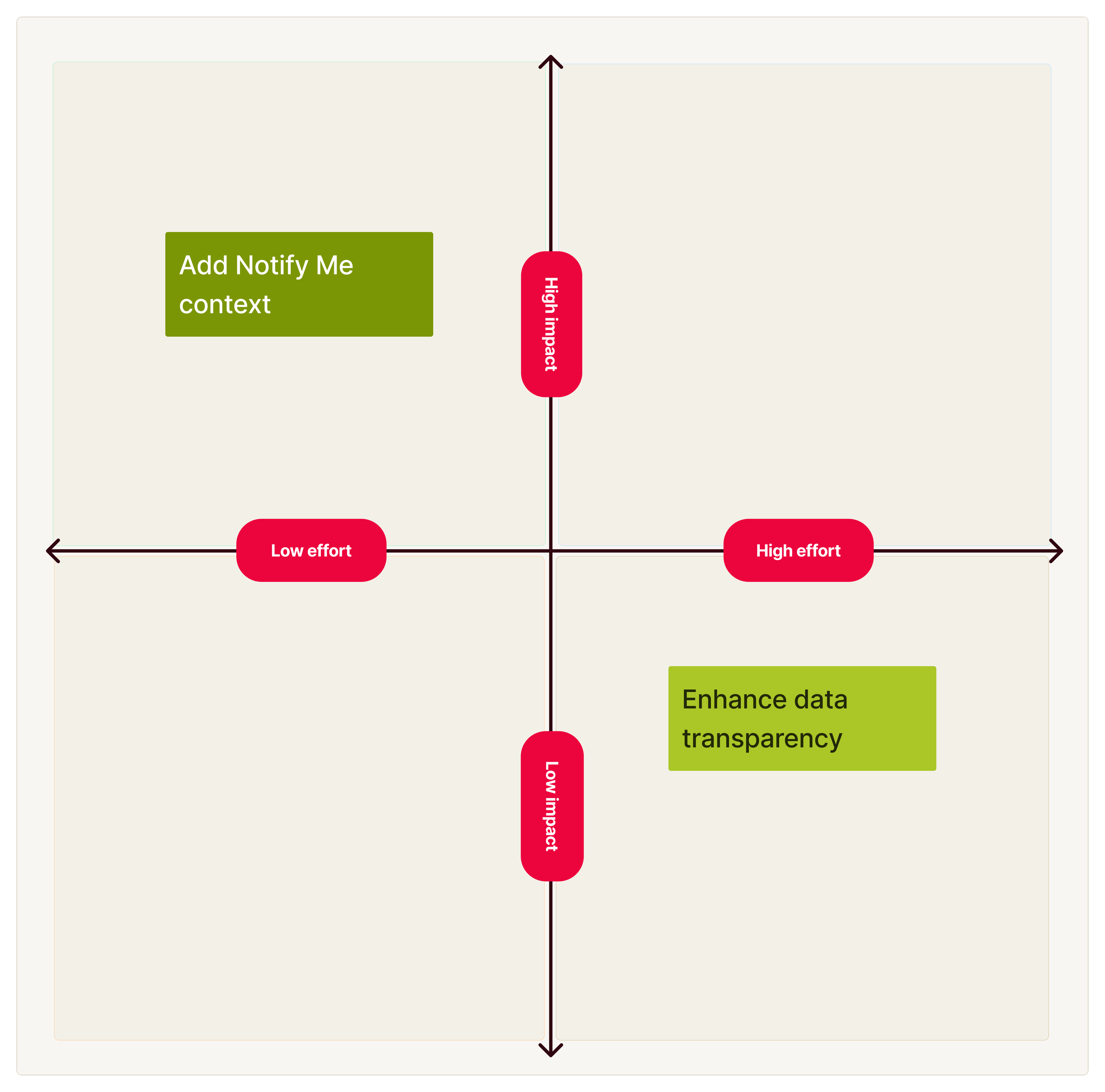
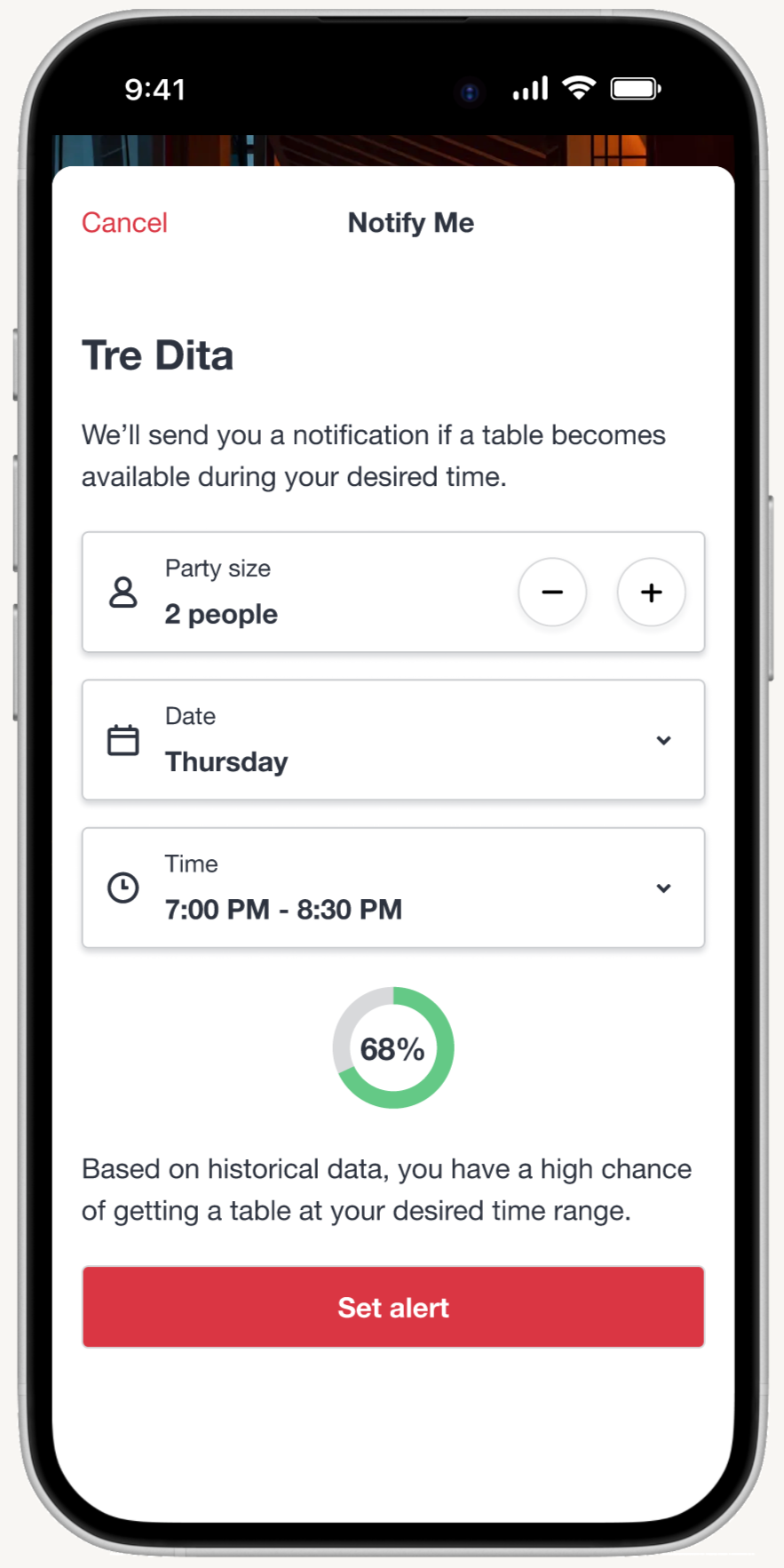
Enhance data transparency: Adding historical context such as average cancellations per week, typical notification-to-booking times, and peak demand patterns for users to make an informed decision before signing up for Notify Me. This requires high effort for the team to obtain historical data and analyze patterns in a digestible format for users. Only one participant requested this feature.
Add Notify Me context: Addresses pain points expressed by multiple participants regarding queue position and understanding how Notify Me works. This clarification requires minimal development effort (simple text addition) while setting proper expectations and potentially reducing support inquiries.
Recommendation priority:
Immediate priority: Implement the high-impact, low-effort improvement by adding clarifying text about how Notify Me works. This should explain that all users are notified simultaneously (not queue-based) and can be added to the existing info tooltip with minimal development effort.
Future consideration: Revisit the data transparency enhancement once the immediate pain points are addressed and if additional user research indicates broader demand for detailed historical reservation data.
Iterations
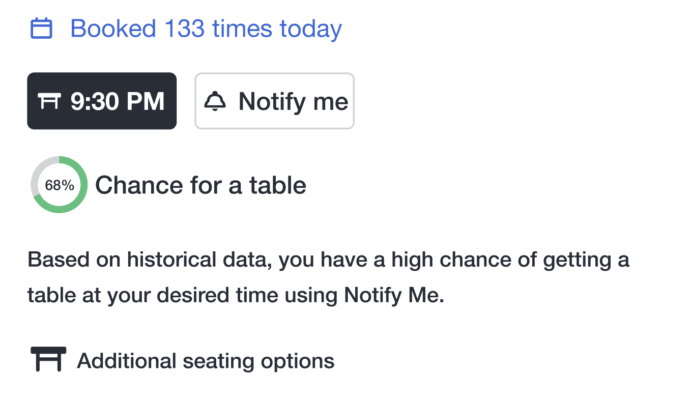
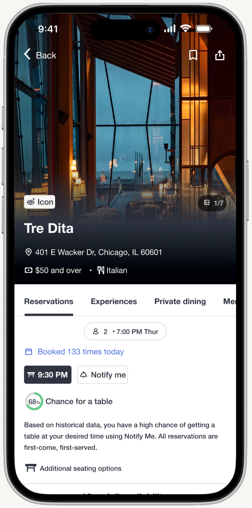
1. Clearer notify me context
Problem identified:
Users were unclear about how the Notify Me feature worked, leading to confusion about whether notifications were queued or first-come, first-served. Users may have assumed a waitlist system or expected guaranteed reservations, causing potential frustration or misclicks.
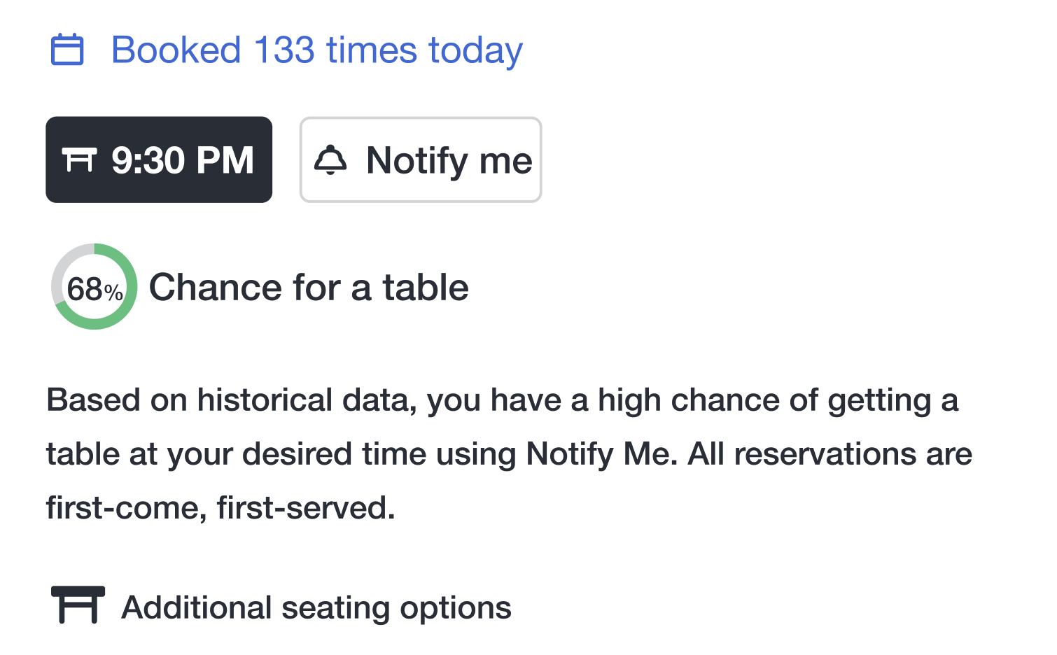
Solution implemented:
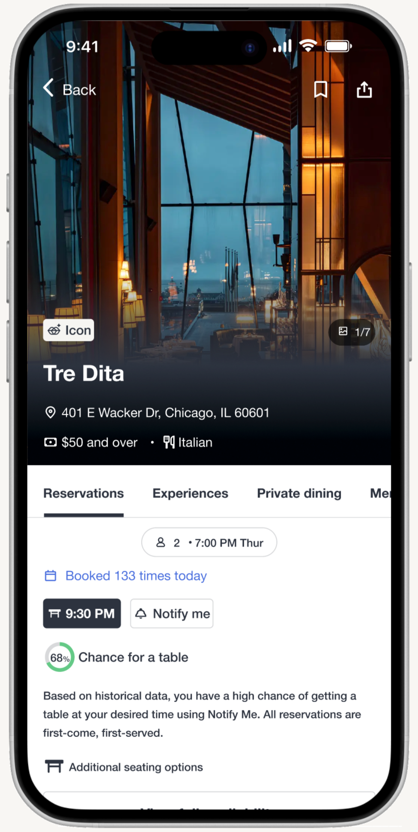
Added supporting text under historical likelihood of securing a table to clarify the feature before users select it: “Based on historical data, you have a high chance of getting a table at your desired time using Notify Me. All reservations are first-come, first-served.”
Results:
Visitors now have clear guidance on how Notify Me works and know what to expect before signing up for an alert.
Original
Update
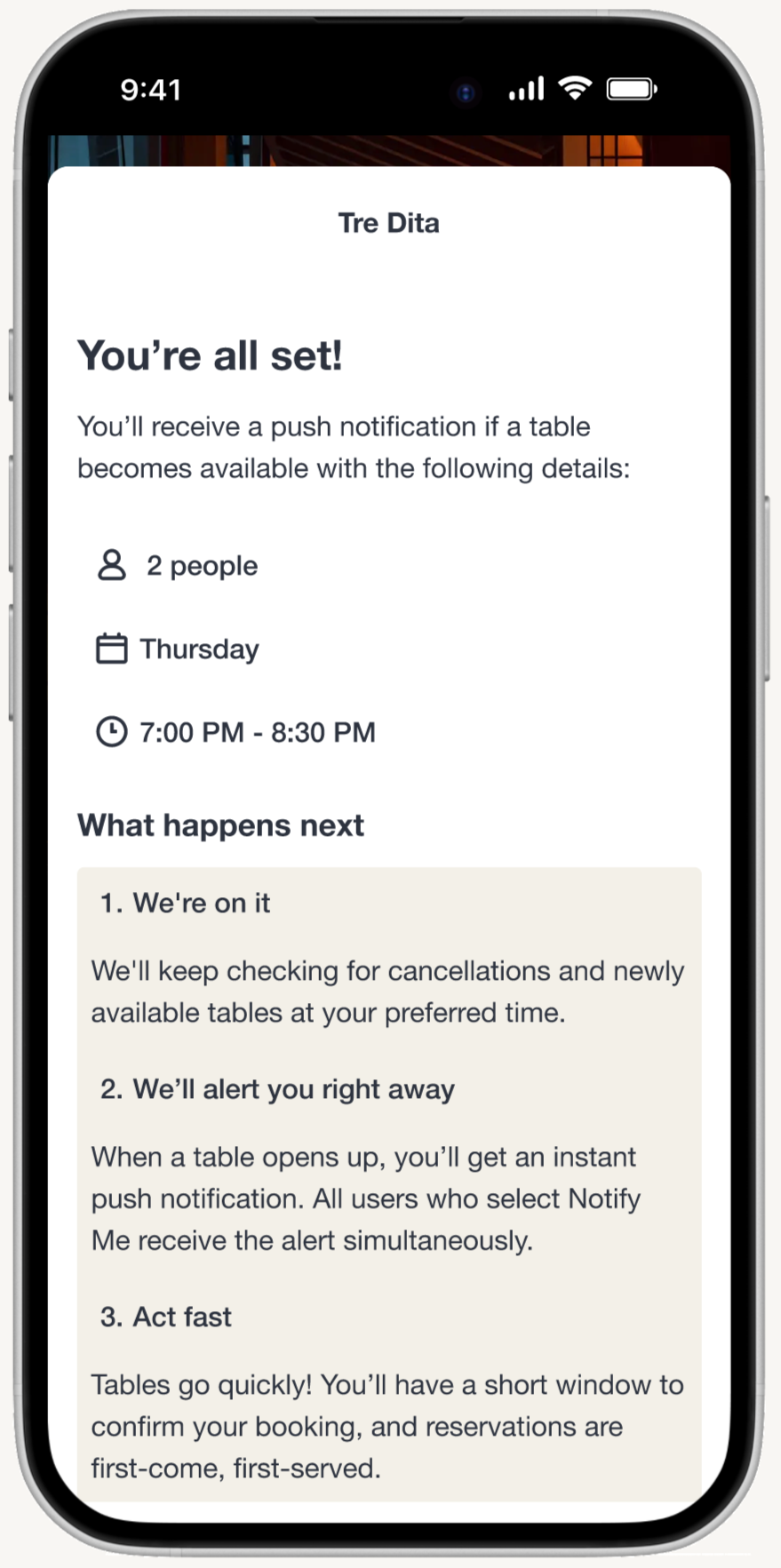
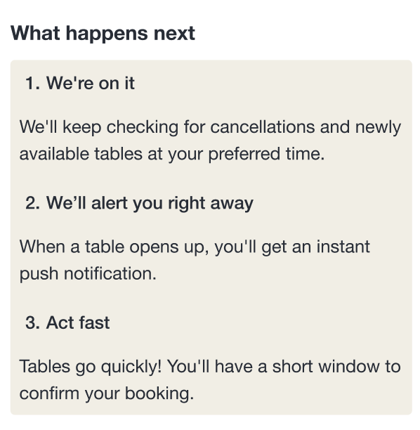
2. Updated notify me instructions
Problem identified:
Usability testing revealed that participants were not aware that once they received a Notify Me alert, they only had a short window to confirm a booking. This leads to potential confusion and reduces the perceived reliability of the feature.
Solution implemented:
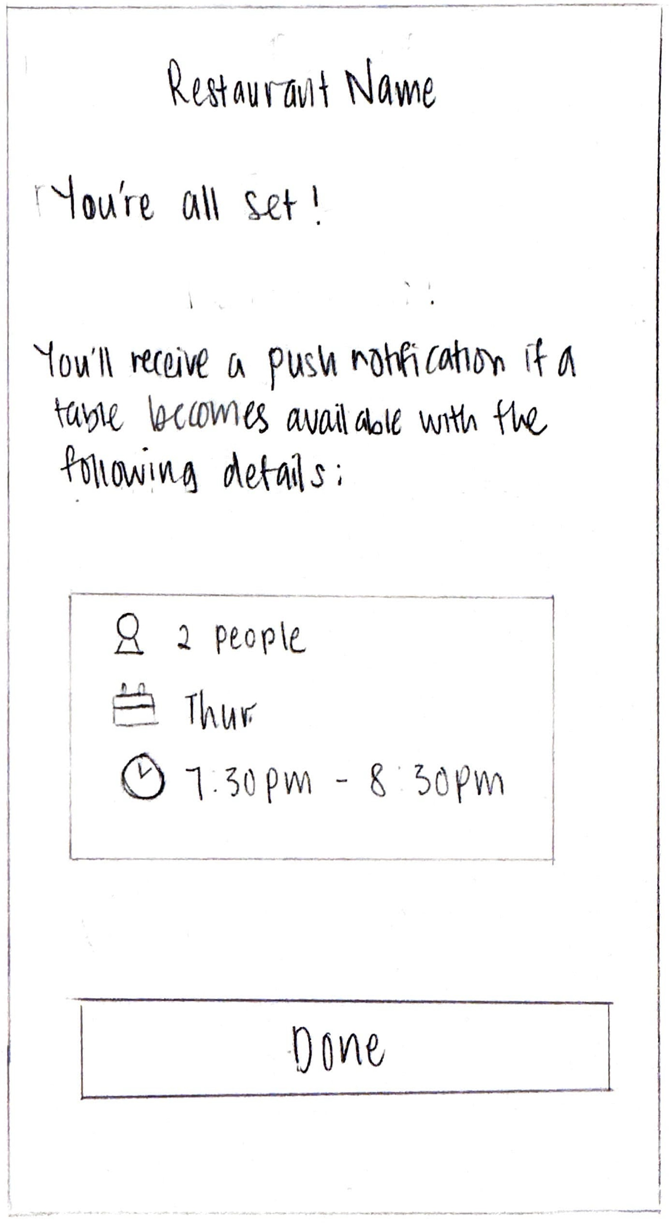
Enhanced instructional messaging to communicate the time-sensitive nature of notifications and that all users receive alerts simultaneously under step 2 “When a table opens up, you’ll get an instant push notification. All users who select Notify Me receive the alert simultaneously.” and step 3 “Tables go quickly! You’ll have a short window to confirm your booking, and reservations are first-come, first-served.”
Results:
Users better understood the time-sensitive, first-come-first-served nature of how Notify Me alerts work, reducing confusion and setting realistic expectations.
Original
Update

Prototype
Conclusion
Key challenges
Technical testing limitations: The Maze bug that prevented several participants from completing Task Scenario 2 created data gaps that complicated my analysis. With limited time, I had to re-run the study with new participants and I had to work with incomplete data while clearly documenting limitations. This taught me to build buffer time into project plans for unexpected technical issues.
Data limitations: Not having real data to analyze the existing notify me, as I don't actually work for OpenTable.
Not offering exact waitlist positions: Interviews showed users wanted this, but it’s not feasible with OpenTable’s real-time restaurant-side systems. Instead, the success probability calculated based on historical data was provided.
Key takeaways
Research can uncover adjacent opportunities you weren’t originally looking for: The original brief focused on clarifying Notify Me, but interviews revealed deeper issues: failed waitlist attempts, fully booked restaurants, and users missing important outings. These unmet needs gave rise to smart alternative suggestions, which is a solution that went beyond the initial scope but directly aligned with user pain points. This taught me that strong UX design is not about sticking narrowly to the brief, but about expanding responsibly when the research points to a larger opportunity.
Designing within constraints is a skill that forces sharper decision-making: Working inside OpenTable’s established design system meant I couldn’t rely on visual UI solutions alone. I had to solve problems primarily through microcopy, hierarchy, and behavior instead of new layouts or components. This constraint pushed me to be more intentional about communication and to think about how small changes fit within a large-scale, production-ready ecosystem.
Designing for edge cases strengthens user trust: One of the prototype flows accounted for a scenario where the probability percentage was unavailable, which is a realistic edge case that occurs when too many users are trying to book the same time slot, preventing the system from calculating historical-based probability. By proactively designing this state and offering clear alternatives, such as signing up for Notify Me or using smart alternative suggestions, the experience still supported users even when the system couldn't provide its usual guidance. This reinforced transparency, reduced confusion, and ensured users always had a clear next step, demonstrating how thoughtful edge-case design can significantly improve reliability and trust in the product.
What I’d approach differently
Build in buffer time for technical testing issues: A Maze bug prevented several participants from completing Task Scenario 2, creating data gaps that complicated my analysis. I had to re-run the study with new participants while working with incomplete data and clearly documenting limitations. In future projects, I'd build buffer time into the timeline to account for unexpected technical issues and have backup testing methods ready from the start.
Seek alternative data sources: Not having access to actual OpenTable data (existing Notify Me performance, real cancellation patterns, user behavior metrics) meant I had to make research-informed assumptions rather than purely data-driven decisions. While I leveraged publicly available industry benchmarks, I would have benefited from conducting more extensive primary research or reaching out to industry professionals earlier in the process to validate assumptions and strengthen the foundation for design decisions.