
Project details
Duration: 8 weeks
My role: Sole product designer responsible for the UX/UI process, from initial research and persona development through final prototyping
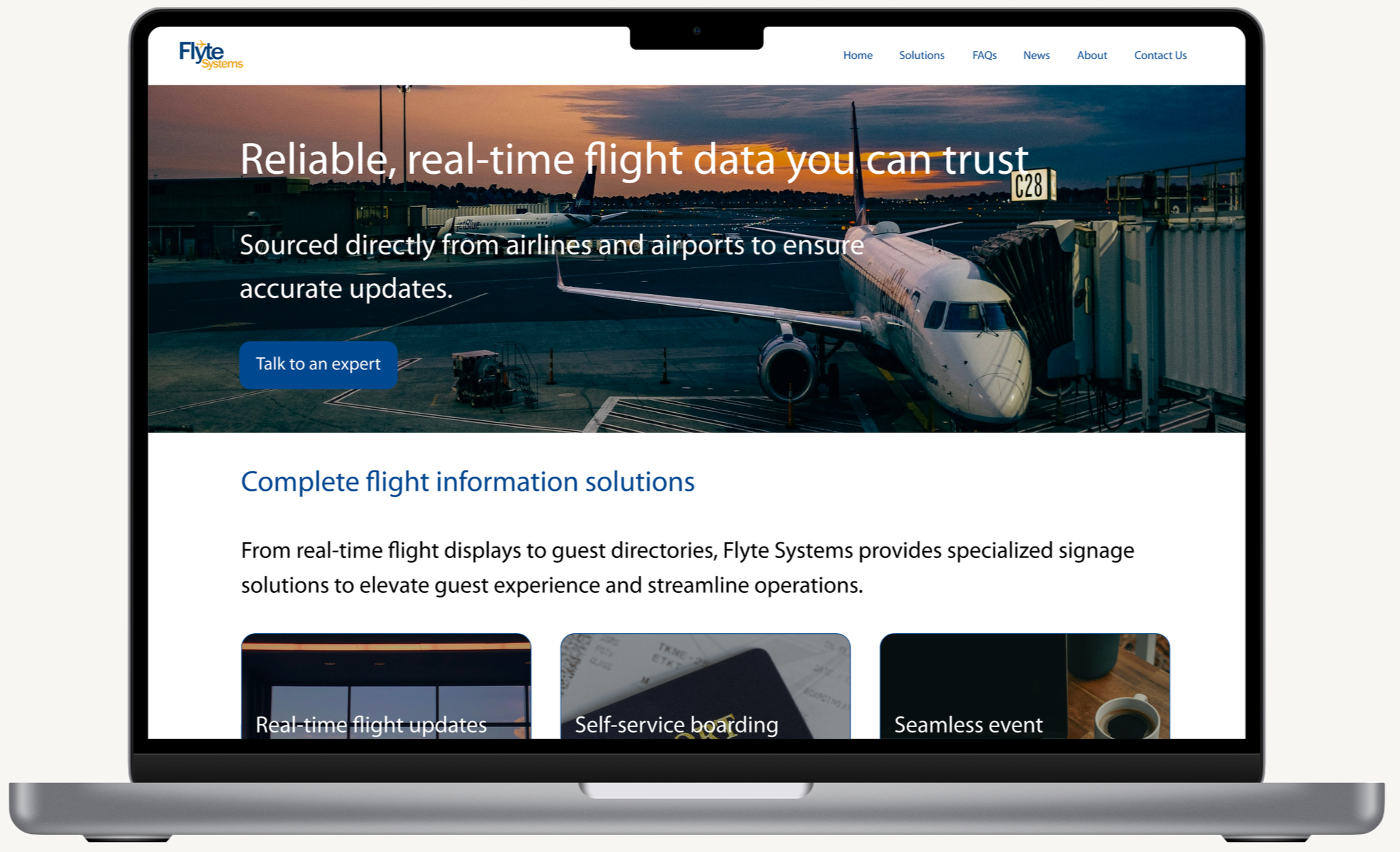
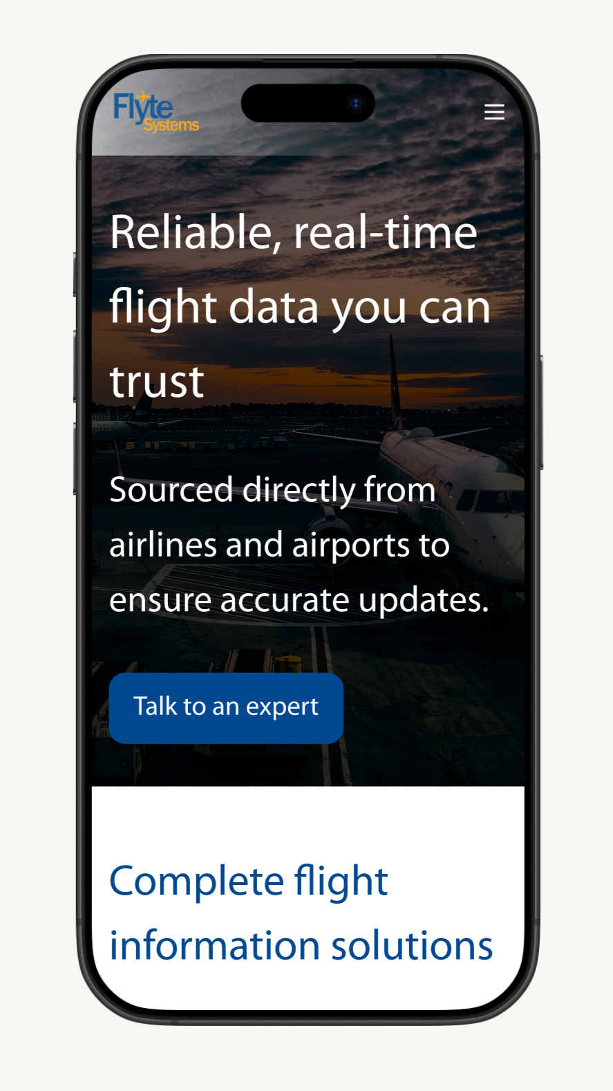
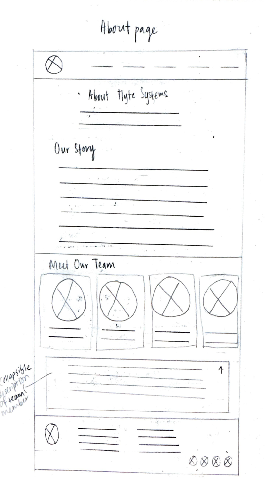
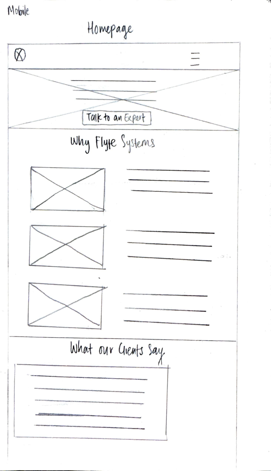
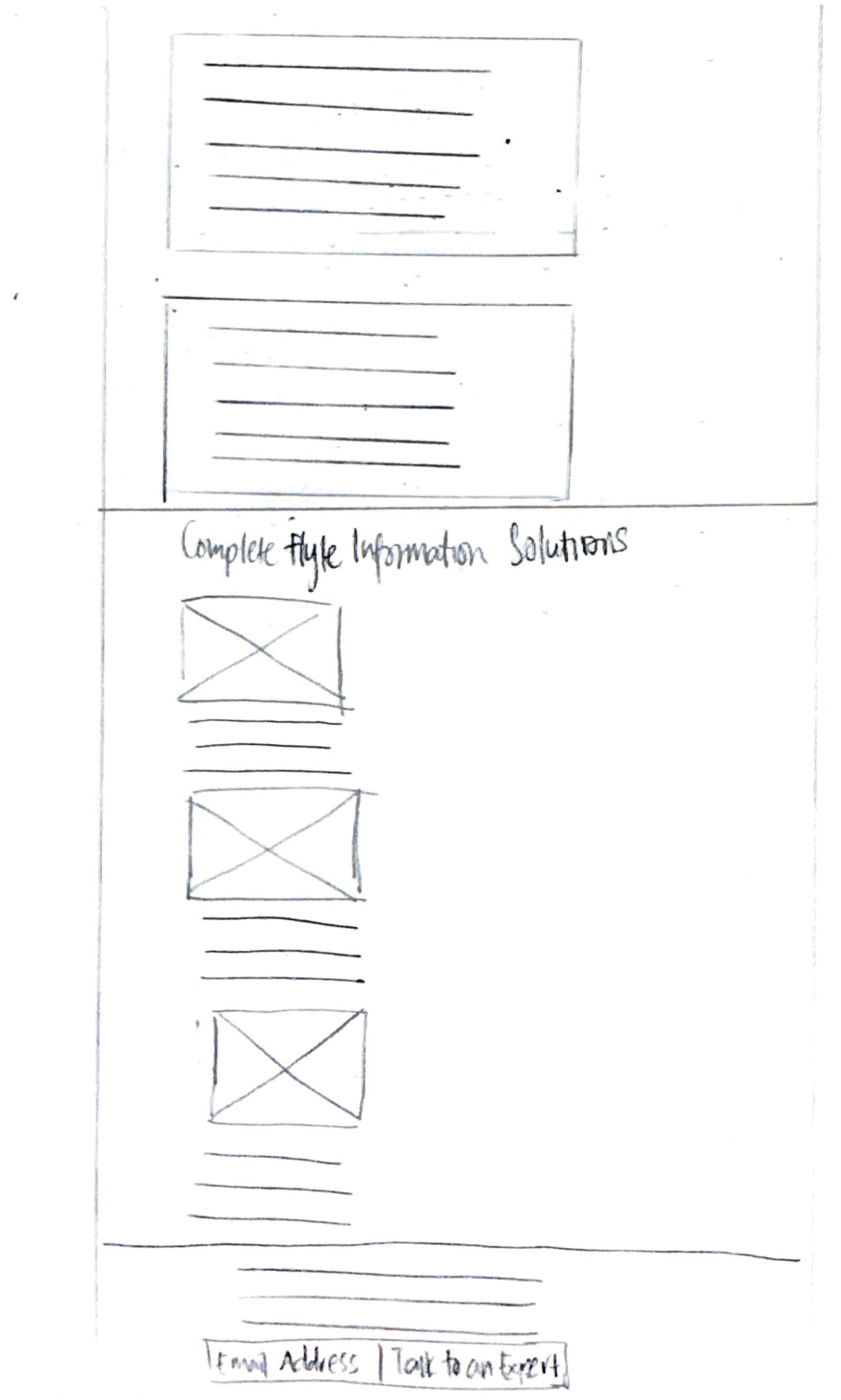
Solution overview: The redesigned website clarifies Flyte Systems’ custom pricing process by setting clear expectations for next steps and showcasing client testimonials to build immediate credibility.
Final deliverables: Through iterative testing of wireframes and prototypes, I developed a user persona, user flows, and high-fidelity prototypes aligned with Flyte Systems’ brand guidelines. The redesign reduces uncertainty in the inquiry process, helping qualified prospects move forward with confidence while establishing trust from the first interaction.
The problem
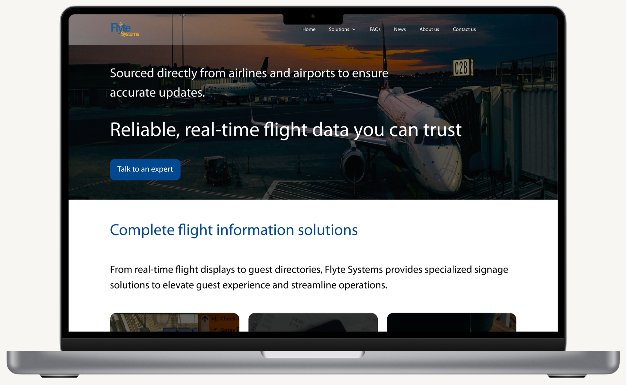
Decision-makers rely heavily on vendor websites to evaluate credibility during early-stage research, yet Flyte Systems' site creates barriers that prevent qualified leads from moving forward. Participants in this study dismissed websites lacking polished design, client logos, or visible testimonials within seconds, often before considering the product capabilities. For Flyte Systems, this means that potential customers may eliminate them based solely on perceived professionalism, rather than actual fit or expertise.
Beyond trust concerns, decision-makers expressed frustration with unclear pricing and vague next steps. While they understand digital signage requires custom quotes, they need enough transparencyto self-qualify before committing to a sales conversation. Without this context, interested prospects can't determine budget alignment or understand what happens after they reach out, causing them to abandon the process entirely.
Who I was solving for
My primary focus was on the following user groups:
Decision-makers who need to build confidence before engaging with vendors, as evidenced by participants who stated they won't consider vendors with poor-quality websites or those without reviews.
Budget-conscious decision-makers who need to gauge project fit and investment levels before committing time to sales conversations.
User research methodology
My primary research focused on the following:
Conducted interviews with potential clients in FlyteSystems’ target industries (airports, hotels and resorts, convention centers, and public transportation) to understand how they currently research and evaluate digital signage solutions online.
Identified key competitors in the digital signage space and indirect competitors to help uncover opportunities and understand how to redesign the website to better attract, inform, and convert prospects into leads.
User interview participants
Decision makers or contributors to the decision making for choosing a digital signage solution vendor in target industries
People who recently evaluated digital signage providers but didn't purchase
People who use competitor digital signage solutions
A diverse range of participants who are decision makers or contributors to the decision making process across industries, company sizes, and geographic locations
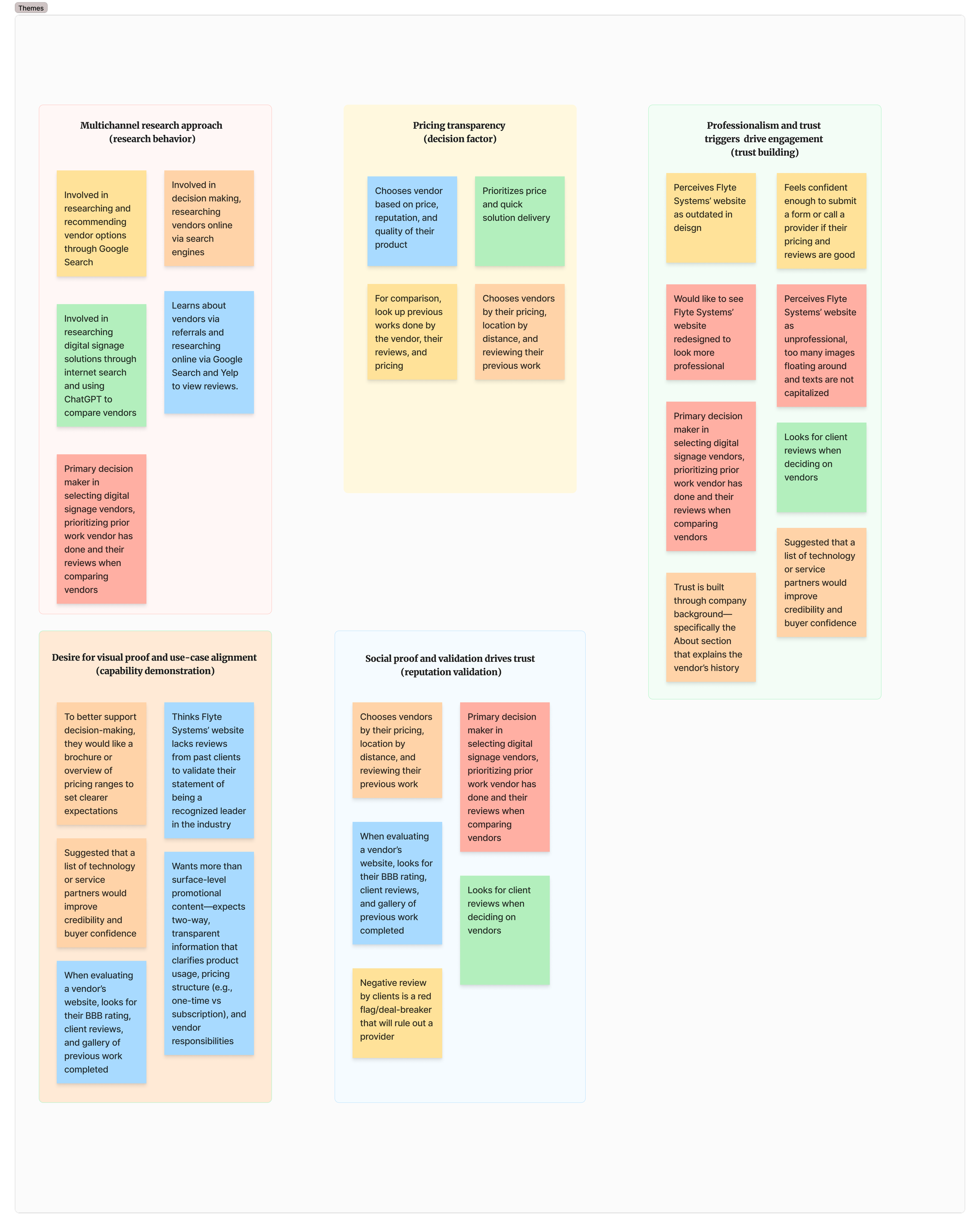
Key interview insights
Discovery happens through search and social proof: Prospective clients begin their vendor search on Google, then validate options through online reviews, portfolio examples, and peer recommendations. Platforms like Yelp and AI tools supplement their research. Visual evidence of past work and third-party validation play critical roles in the shortlisting process.
Price and reputation drive final decisions: Cost emerged as the primary selection factor, followed closely by portfolio quality and business ratings. This signals a need for transparent pricing communication and prominent display of successful projects to establish immediate value and credibility.
First impressions build or break trust: Users look for specific trust indicators: client testimonials, portfolio showcases, clear pricing guidance, and transparent service models. A modern, clean website design directly impacts perceived legitimacy. Outdated or cluttered sites cause potential clients to bounce before engaging.
These insights shaped Flyte Systems' design direction: a polished, credible website that leads with portfolio work, transparent pricing, and client testimonials to build immediate trust.
Affinity map
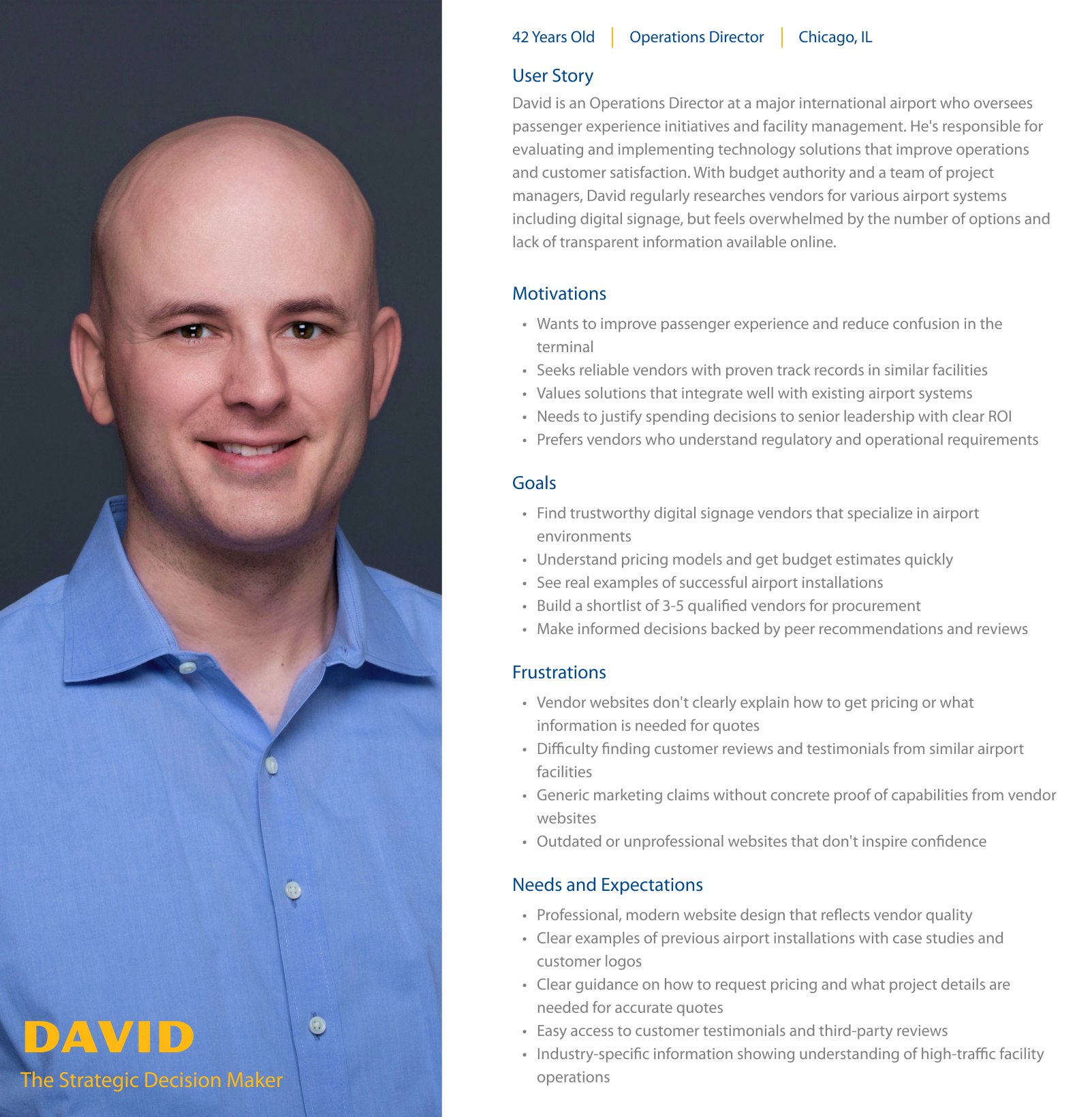
User persona
Problem framing
From the research themes, I developed a Point of View statement:
I'd like to explore ways to help decision-makers engage with Flyte Systems because the website's lack of professional trust signals and unclear pricing process prevents them from gaining the confidence needed to request a quote, resulting in lost opportunities for solutions that could meet their digital signage needs.
This led to several How Might We questions:
How might we provide real-time waitlist position tracking so users know exactly where they stand when they try to book a reservation?
How might we display historical success rates for waitlists to set realistic expectations?
How might we create dynamic availability updates that keep users informed of their booking chances?
How might we design reassuring status messages that reduce anxiety during the booking process?
The proposed solution
Based on the key research insights and HMWs, we envisioned a redesigned website that establishes immediate credibility and provides a clear, transparent path to obtaining custom pricing, enabling decision-makers to confidently evaluate and engage with Flyte Systems.
Increased lead generation through improved trust signals and professional design that keeps prospects engaged during initial research.
Competitive differentiation by showcasing portfolio work and client testimonials prominently on the homepage.
Reduced sales friction with a streamlined quote request process that qualifies leads while clearly communicating the custom pricing approach and next steps.
Business impact
User impact
Decision-makers can quickly assess Flyte Systems' credibility through visible client testimonials and professional design.
Decision makers understand what information is needed for custom pricing and what to expect during the quote process, reducing uncertainty and building confidence to move forward.
Budget-conscious decision-makers feel respected and informed with transparent communication about the pricing process, even when exact costs can't be provided upfront.
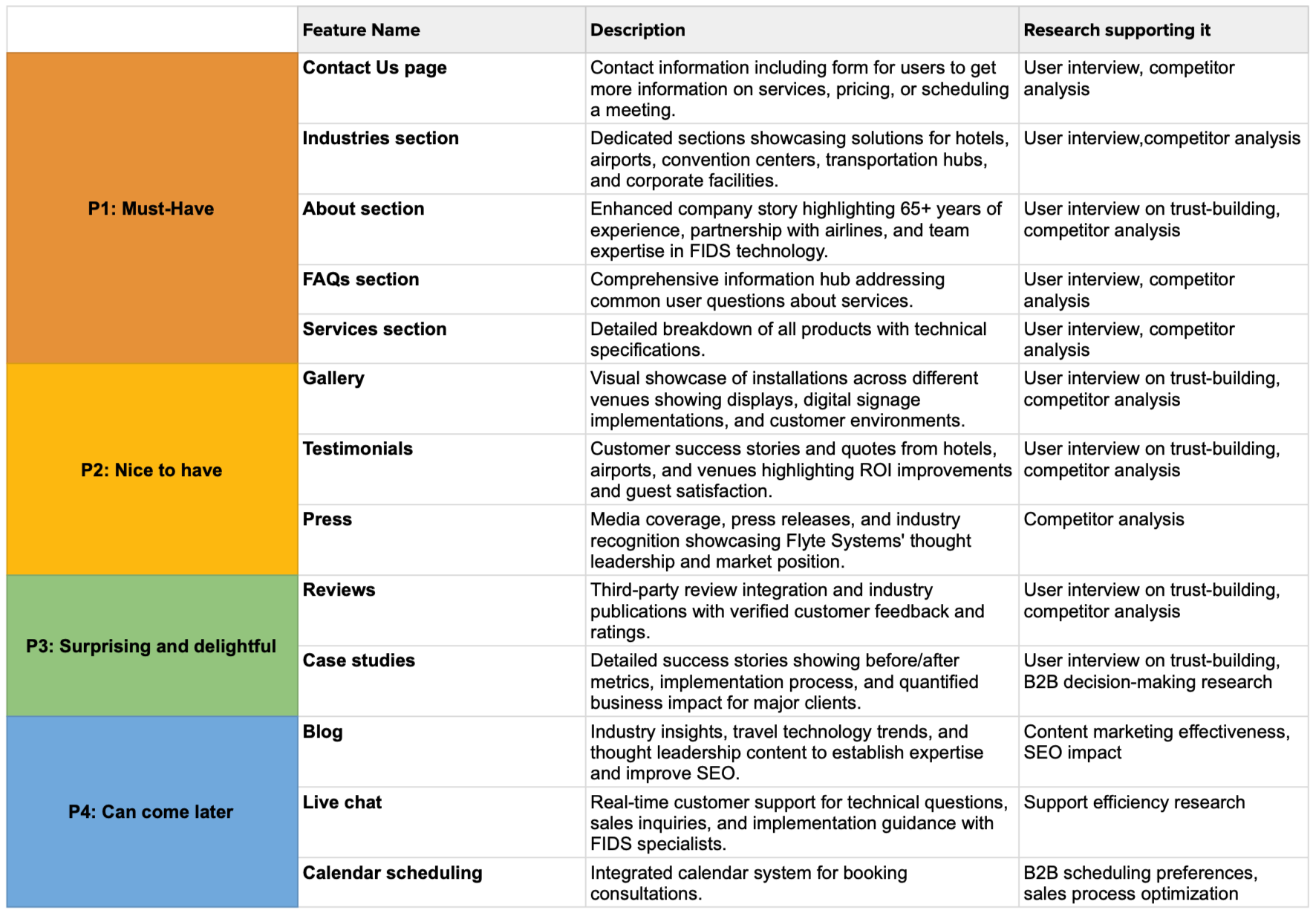
Feature roadmap
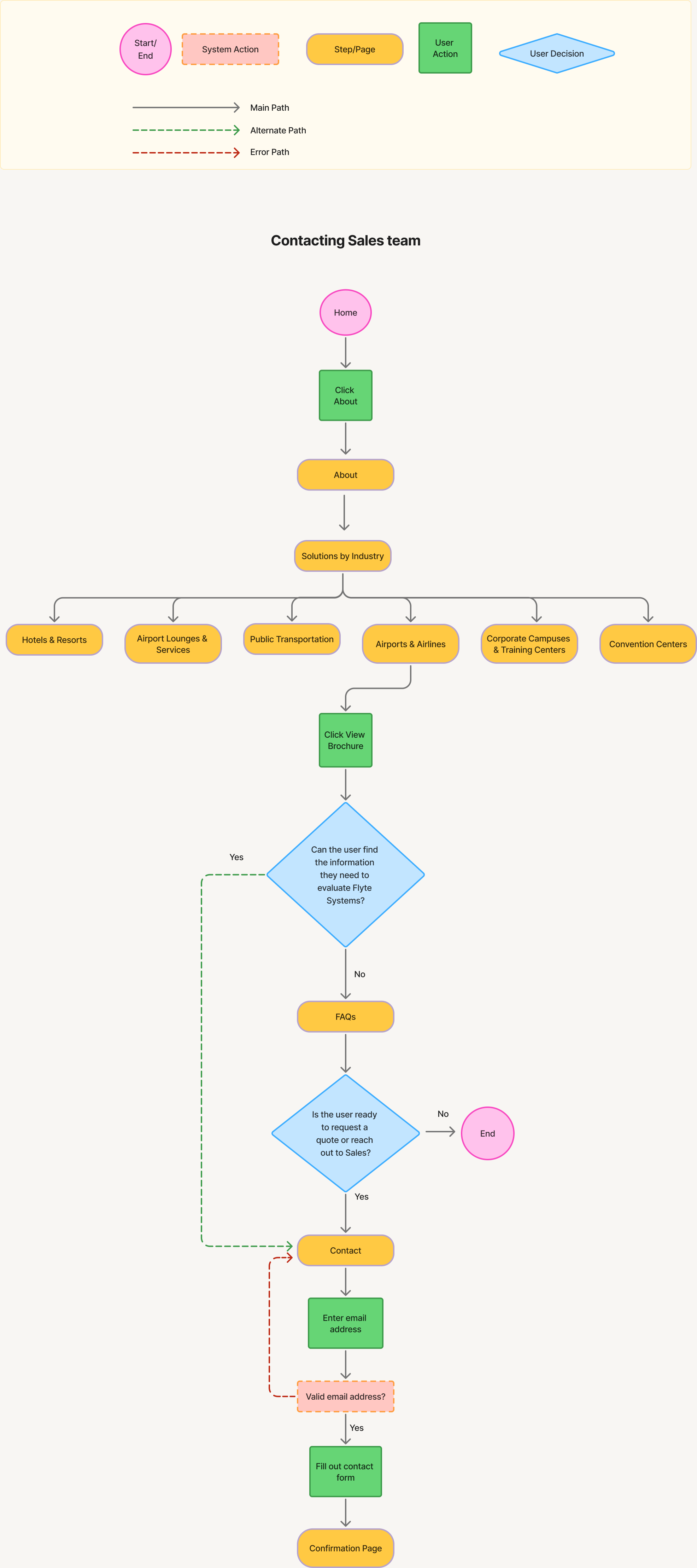
User flow


Usability testing participants
Total participants: 6
A diverse range of participants who are decision makers or contributors to the decision-making process across industries, company sizes, and geographic locations, such as the United States and Canada
Decision makers or contributors to the decision-making process for choosing a digital signage solution vendor in the targeted industries (hotels and resorts, airport lounges and services, airlines, public transportation, convention centers, corporate campuses, and training centers)
People who recently evaluated digital signage providers but did not purchase
People who use competitor digital signage solutions
Usability testing findings
1. Task completion rate
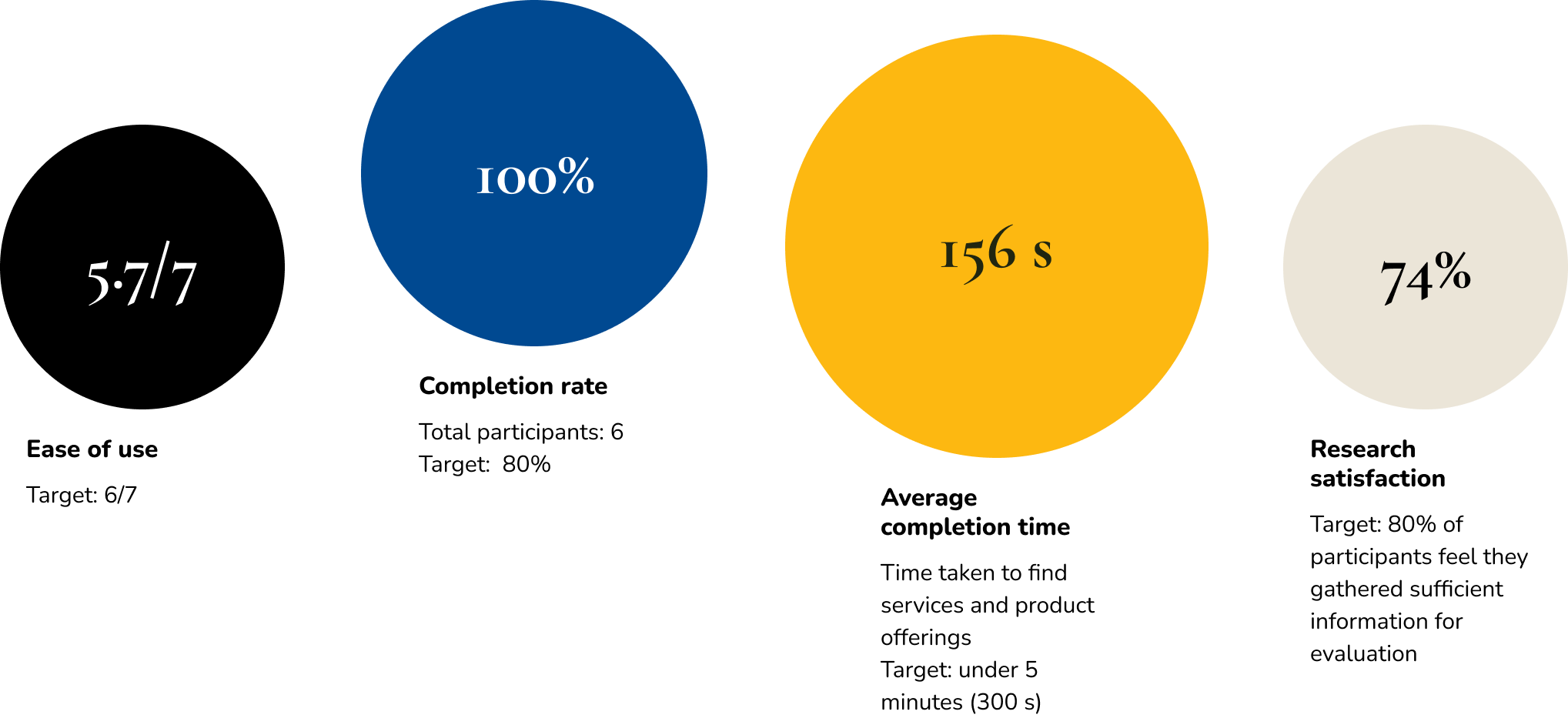
100% completion for finding services and product offerings (Scenario 1)
All 6 participants completed the evaluation task
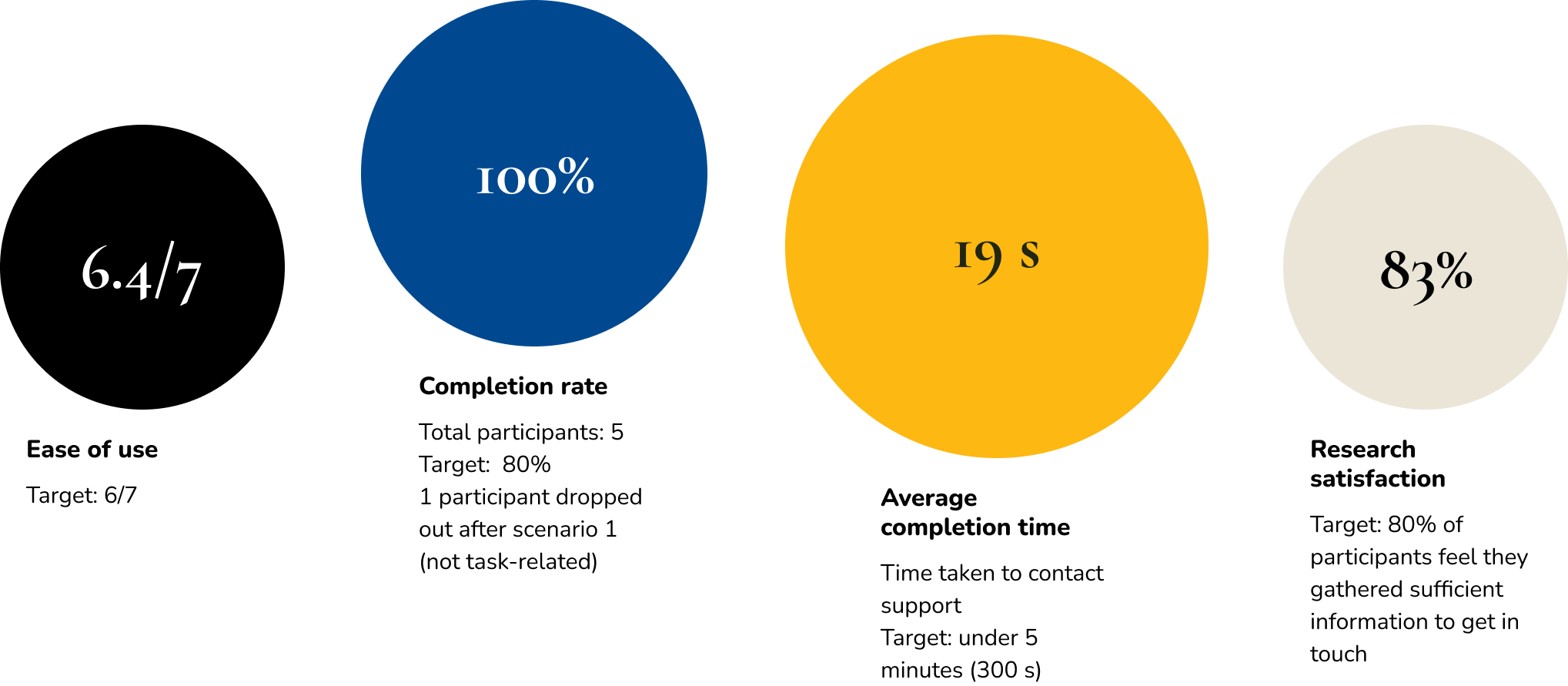
100% completion for contacting support (Scenario 2)
All 5 participants successfully found contact information
1 participant dropped out after Scenario 1 (not task-related)
2. Efficiency
Time on task: Target of under 5 minutes per task flow
2 minutes 36 seconds average duration for service evaluation (Scenario 1)
19 seconds average duration for finding contact information (Scenario 2)
Error rate: Target of fewer than 2 navigation errors per participant
16.7% misclick rate for the contact task indicates minimal navigation errors
No significant navigation issues reported across tasks
A participant clicked “Support” instead of “Contact Us”, which is the footer section title, not a clickable link
3. User experience metrics
Perceived ease of use: Post-task rating (1-7 scale) - Target average rating is 6
Scenario 1: "On a scale of 1 to 7, how easy was this research task?" (1=Extremely difficult, 7=Extremely easy)
5.7 average rating for service evaluation (slightly below target)
Scenario 2: “On a scale of 1 to 7, how easy was this task?" (1=Extremely difficult, 7=Extremely easy)
6.4 average rating for contact task
Professional credibility: Target rating is 6 (Mostly trustworthy)
"On a scale of 1 to 7, how trustworthy did you find the information you found about this vendor?" (1=Not at all trustworthy, 7=Extremely trustworthy)
5.7 average trustworthiness rating
Research satisfaction: Target of 80% feel they gathered sufficient information
Scenario 1: “On a scale of 1 to 7, how well did the website help you find what you needed for your evaluation?” (1=Not at all trustworthy, 7=Extremely trustworthy)
5.2 average confidence rating in finding sufficient information(74%)
User feedback:
"I think the website covers majorly everything. However I would expect to see a video demo."
“I would like to see more information on pricing, and how this signage is displayed at the property. For example, is it just one screen in the lobby, or is there a channel on the TV that a guest can tune into, to check the status of their flight.”
Scenario 2: On a scale of 1 to 7, how well did the website help you find what you needed to get in touch with Flyte Systems? (1=Not at all helpful, 7=Extremely helpful)
5.8 average confidence rating in finding sufficient information (83%)
Usability test findings
Task scenario 1
Task scenario 2
What’s working well
1. Contact accessibility
19s
Average completion time
100%
Task completion rate
The contact/support functionality performed exceptionally well. Users consistently found the contact button easily, with one participant noting: "I was looking for their 'contact us' or 'support' button. It was located on the top right of the webpage which made it easy to find. The contact form was very simple to use."
2. Intuitive basic navigation
6.4/7
Ease of use (scenario 2)
5.7/7
Ease of use (scenario 1)
Users found the fundamental website structure easy to navigate, with comments like "the UI was very easy to understand and was very fluid to use" and "I found the service surprisingly easy to understand in addition the offerings were as well." Additional positive feedback included: "It was easy to understand. There was nothing wrong with it" and "Everything was easy to understand."
Iteration recommendations
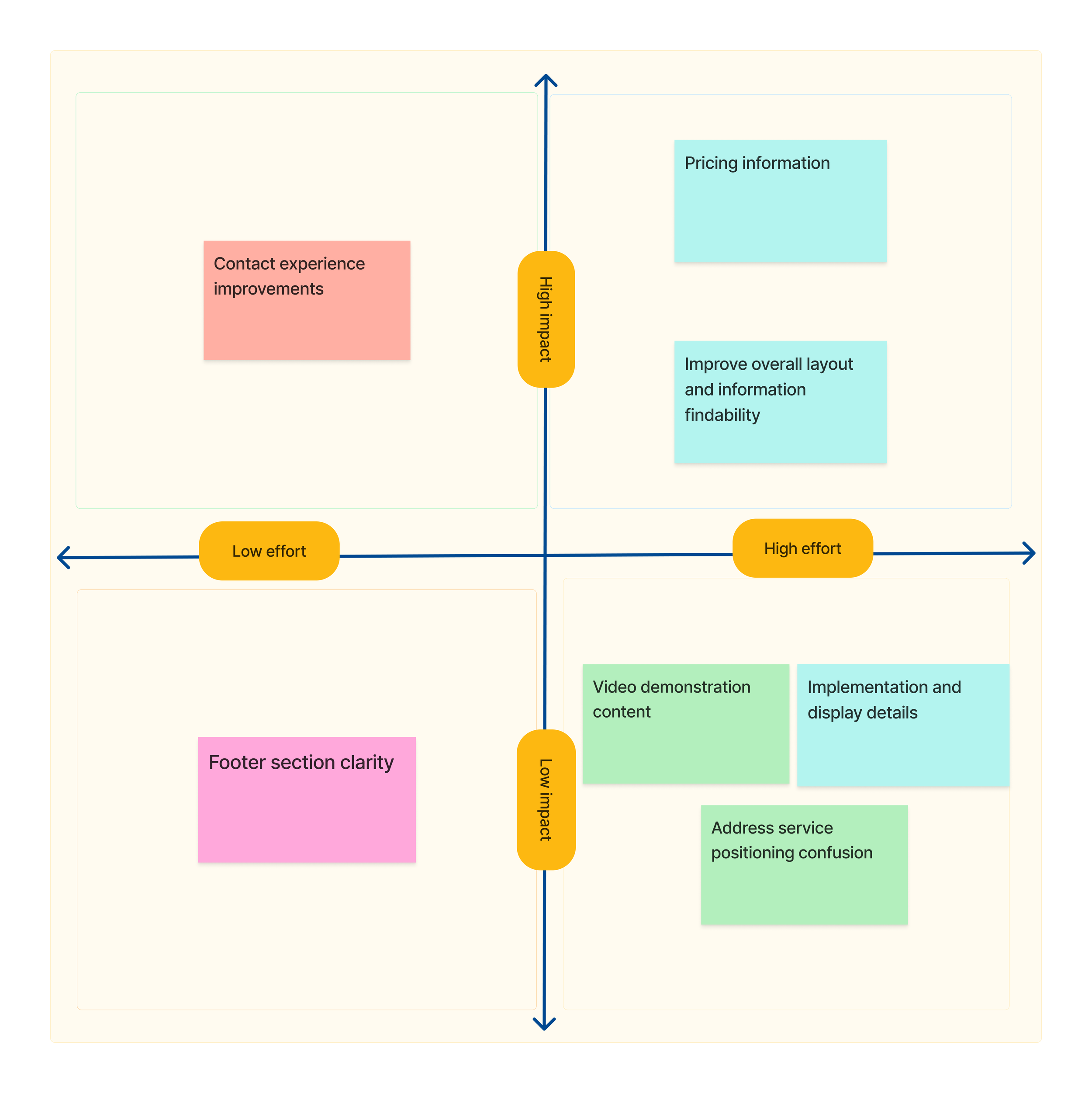
Video demonstration content
Add video demos of the digital signage solutions in action
Enhanced Information architecture and layout
Include pricing information or pricing inquiry options
Clarify implementation specifics (single lobby screen vs. TV channel options)
Feature response time expectations more prominently on contact forms and update the footer section title to differentiate between clickable footer links
Pricing and implementation details
Improve overall layout and information findability
Create a clearer distinction between different service offerings
Address service positioning confusion where users expected flight data on the website
Recommendation priority
The Contact experience improvements (high impact, low effort) should be the immediate priority.
Quick wins to implement first:
Add response time expectations to contact forms - addresses the specific feedback "A response time for how long it would take to hear back was missing"
Fix footer section confusion - resolve the issue where user "clicked on support but nothing happened" by making it clear what's clickable vs. just a section header
These improvements:
Require minimal resources (just UI/content updates)
Show immediate results to stakeholders
Iterations
After
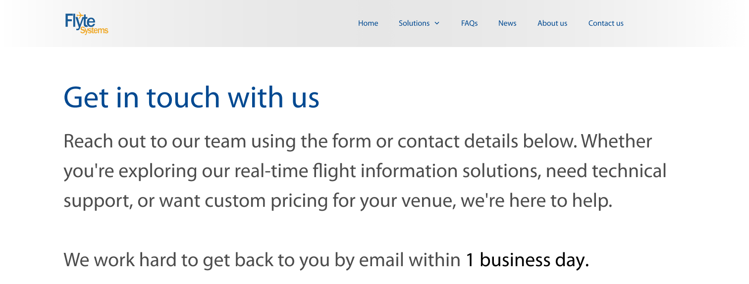
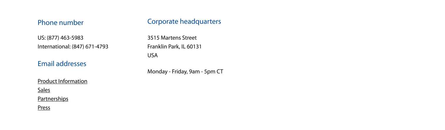
1. Contact us page enhancement
Problem identified:
The company uses custom pricing, but the website lacked pricing information, causing visitor frustration. The contact us page didn't explain how pricing works or provide clear expectations.
Solution implemented:
Added a clearer subheading explaining how customers can obtain pricing information.
Made the existing response time expectation more prominent by displaying it as a standalone sentence.
Added business days and hours information.
Results:
Visitors now have clear guidance on the pricing process and know what to expect when contacting the company.
Before
Addition of business days and hours
After
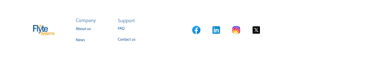
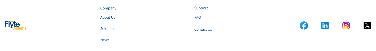
2. Footer navigation fix
Problem Identified:
Usability testing revealed that a participant was "clicking on support, but nothing happened," indicating confusion about which elements were clickable and which were section headers.
Solution Implemented:
Redesigned the footer to clearly distinguish clickable links from section headers.
Improved visual hierarchy to prevent user confusion.
Result:
Visitors can now easily identify and interact with clickable elements in the footer.
Before
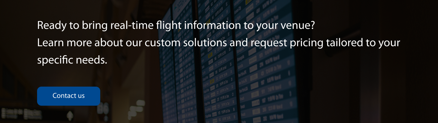
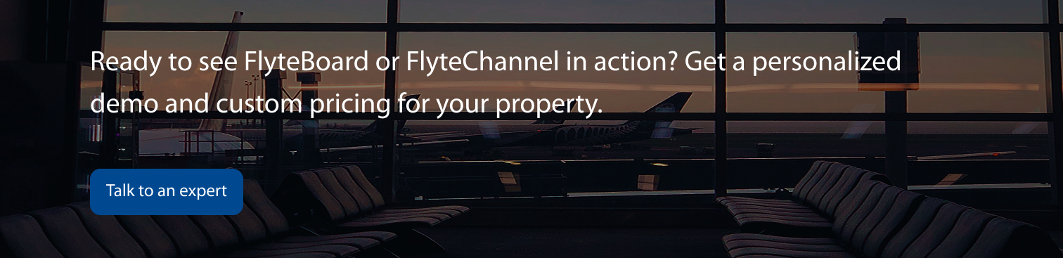
3. Banner updates for pricing clarity
Problem Identified:
Visitors needed easier access to pricing information throughout the site.
Solution Implemented:
Updated website banners to clarify that pricing information is custom
Made pricing guidance more prominent and accessible across multiple pages
Result:
Pricing information is now more visible and accessible to visitors browsing the site.
Original banner 1
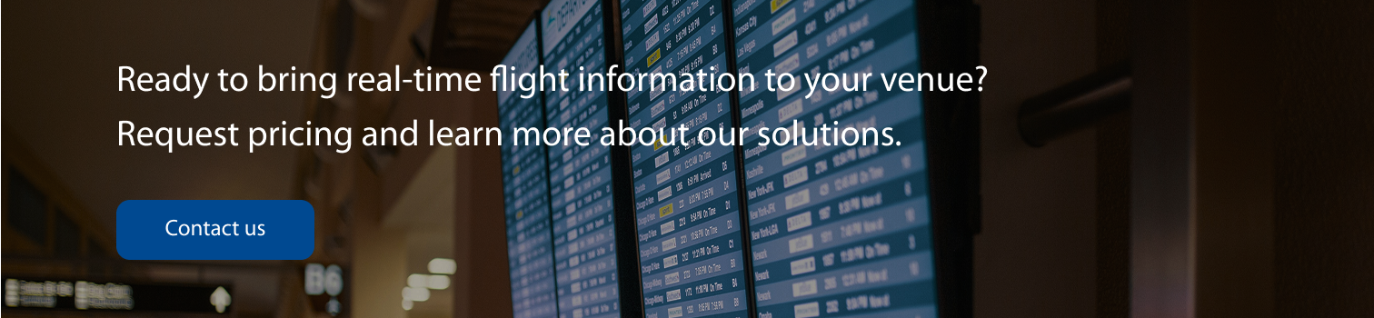
Updated banner 1
Original banner 2
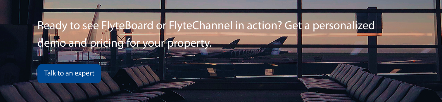
Updated banner 2
4. Logo accessibility improvement
Problem Identified: The original logo lacked sufficient contrast when displayed on black or white backgrounds, creating accessibility issues.
Solution Implemented:
Updated logo colors to meet accessibility standards
Ensured new colors pass Figma's contrast checker
Maintained brand consistency while improving accessibility
Color Changes:
Primary blue: #004991 → #1B5D97
Primary yellow: #FDB811 → #EFA929
Result: The logo now meets accessibility standards while preserving the company's brand identity.
Original logo
Updated logo
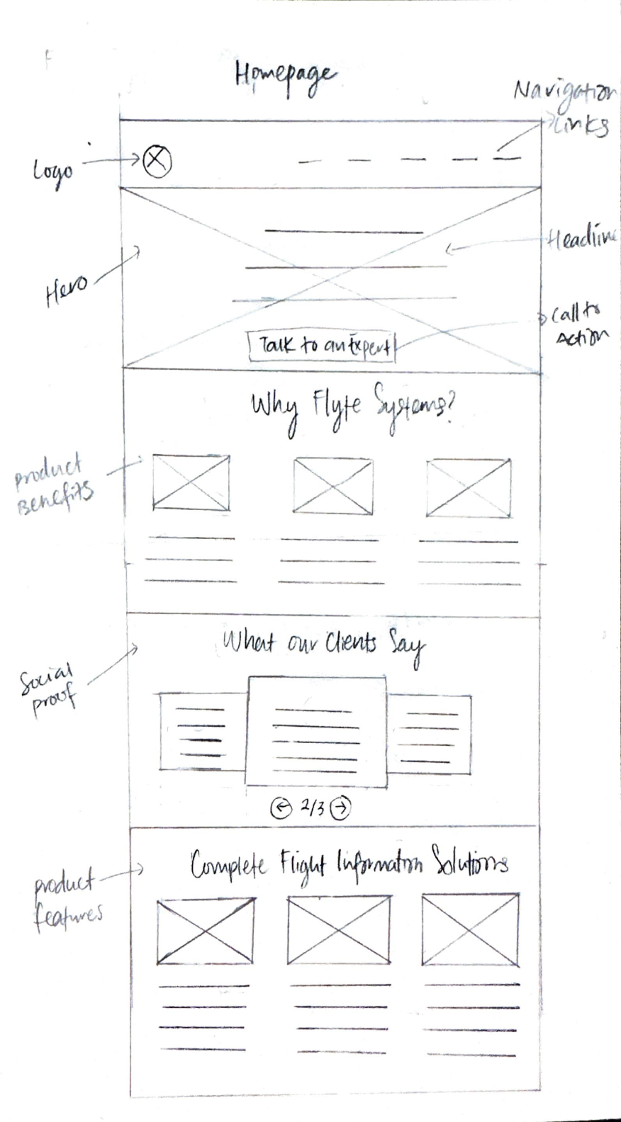
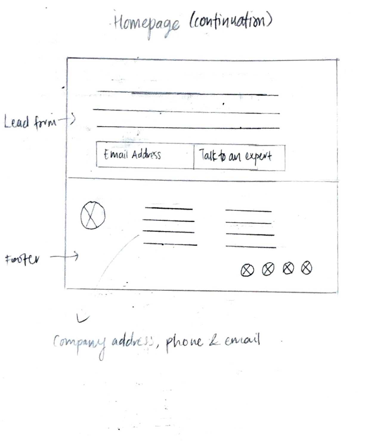
Prototype
Conclusion
Key challenges:
Designing with outdated assets: Flyte Systems had not updated its website content or images in over 5 years, which meant I had to design around blurry, photoshopped, or outdated visuals. The challenge was creating a modern, professional-looking website without the benefit of fresh brand assets. I addressed this by focusing on layout and white space, making the website feel clean and credible despite limited imagery.
Recruiting research participants: Because the project targeted B2B decision-makers, finding qualified participants was difficult. I leveraged Maze to access panels, but the pool was small. If I had to recruit independently, it would have required far more time. This taught me the importance of planning research recruitment strategies early in the project.
Key takeaways:
B2B research: Through this project, I gained a deeper understanding of the nuances of conducting research in a B2B context. I learned that B2B purchases often involve multiple stakeholders with different priorities, which made me consider how credibility and trust-building influence decision-making across roles. I also saw that a company’s website isn’t just informational — it plays a critical role in vendor shortlisting, where design choices like testimonials and modern visuals can directly affect whether a company is taken seriously. Conducting research in this context also highlighted the importance of carefully framing screening and interview questions to account for participants’ limited time and potential biases. Beyond gathering insights, I realized that part of my role was helping stakeholders empathize with users, using research evidence to guide the client toward decisions that serve both their business and their customers.
The power of whitespace: I saw firsthand how effective whitespace can be in creating a modern, professional feel, especially when working with outdated content or visuals.
Balancing constraints with creativity: This project reinforced the reality that UX design is often about making the best possible experience within business and resource limitations. By focusing on clarity, structure, and trust signals, I was able to deliver value even when assets weren’t ideal.
What I’d approach differently:
Advocate earlier for professional photography: Flyte Systems hadn't updated its imagery in over 5 years, forcing me to rely on layout and whitespace to create a modern feel. While this worked, high-quality installation photos would have significantly strengthened credibility, which is a core user need from research. I'd present a stronger case for investing in updated visuals earlier, showing their direct impact on conversion and suggesting a phased approach starting with hero images of key projects.
Plan B2B recruitment strategy upfront: Recruiting qualified decision-makers was challenging due to the niche audience. I used Maze panels, but the pool was limited. In future B2B projects, I'd build recruitment time into the timeline from day one and explore multiple channels such as LinkedIn outreach, industry associations, and client referrals rather than relying solely on research panels.